logo design for industrial solutions
Brand Name
Tak
Category
Industrial Solutions
Year
2010
The Client
TAK is a brand specializing in Industrial Solutions, likely providing engineering, machinery, consulting, or technical services that operate on a global scale. The brand aims to communicate precision, technical excellence, global reach, and the promise of new beginnings or future-forward technology (Sunrise).
The Challenge
The objective was to create a logo that visually represents the intersection of industrial precision and worldwide operation. The design needed to merge the mechanical elements of the industry (Gear) with the expansive, aspirational concepts of global standards (Earth) and innovation (Sunrise), while maintaining a modern, reliable, and trustworthy appearance.


The Solution (Our Approach)
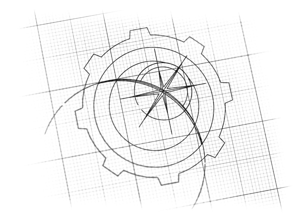
We designed a powerful and balanced emblem that focuses on mechanical precision and global vision by combining three key elements:
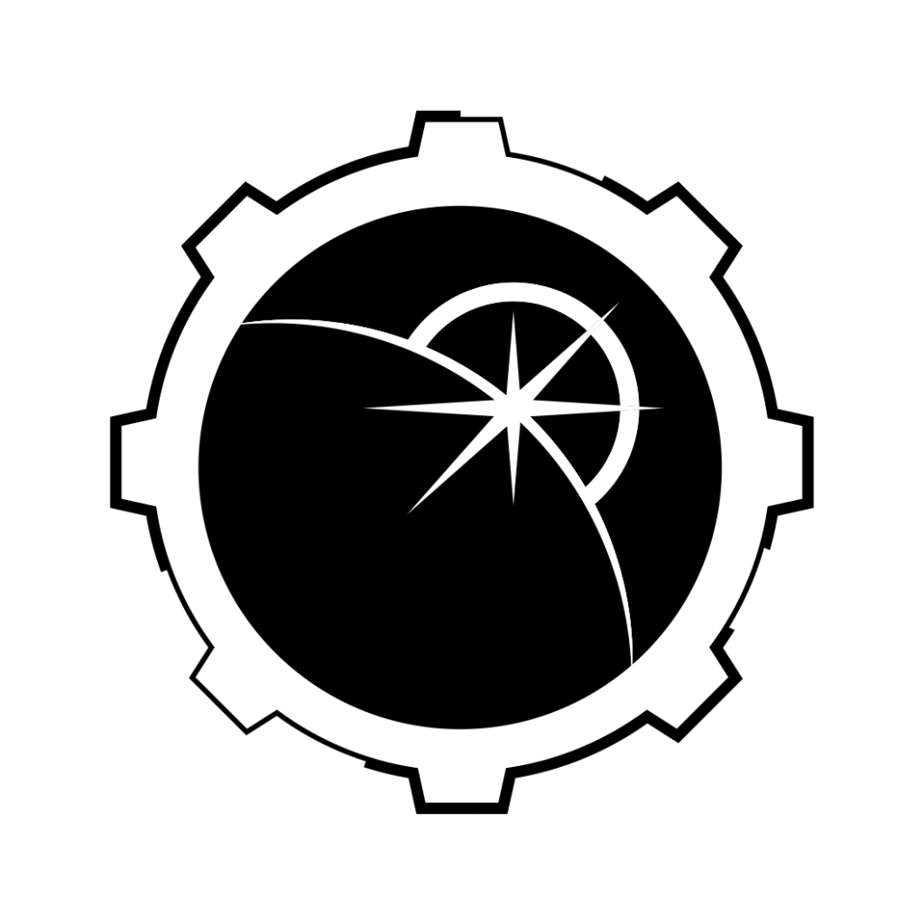
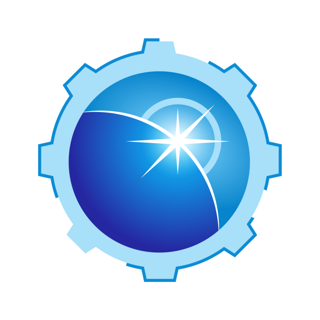
The Cogwheel / Gear (Industrial Solutions): The outer boundary of the logo is a stylized Cogwheel (Gear), the universal symbol for industry, mechanism, engineering, and precision. Its robust shape immediately anchors the brand in the technical and industrial sector.
The Globe and World Standards (Global Reach): The inner core of the emblem features a Globe (Earth) in deep blue. This signifies “Global Standards,” worldwide operational capabilities, and comprehensive reach. The smooth, curved surface contrasts with the rigid gear, representing the application of precise industrial solutions across the entire world.
The Sunrise / Starlight (Innovation and Future): A bright, radiating starburst (Sunrise) is prominently positioned near the globe’s curve. This represents the “Sunrise”—symbolizing innovation, a new beginning, forward-thinking technology, and the bright future the brand helps its clients achieve. The star also functions as a beacon of excellence and leadership.
The Outcome
The final design is a highly successful, coherent, and aspirational mark that immediately elevates TAK’s perceived value in the industrial sector.
The emblem successfully achieves several strategic objectives:
Positions TAK as a Global Leader: By enclosing the vibrant Globe within the mechanical Gear, the logo visually guarantees that TAK’s technical expertise is not confined locally but meets international standards and scalability requirements. It suggests that TAK is capable of driving complex, large-scale projects anywhere in the world.
Communicates Forward-Thinking Technology: The sharp, bright Starburst/Sunrise acts as a powerful focal point. This element signifies that TAK’s solutions are not just current, but future-proof and innovative, promising clients a strategic advantage through superior technology and foresight. It implies that TAK is the dawn of a new era in industrial efficiency.
Instills Absolute Trust and Reliability: The cool, consistent Blue Palette combined with the rigid, organized form of the Cogwheel creates a strong impression of reliability, precision engineering, and technical competence. This is critical for clients seeking dependable industrial and consulting services.
High Versatility and Recognition: The design is structurally clean, ensuring high visibility and recognition across all mediums, from digital platforms to machinery decals and corporate stationery. It provides a distinctive, modern mark that stands out from more traditional, dated industrial logos.
Overall, the logo transforms TAK from a simple service provider into a global, forward-looking partner that integrates mechanical precision with a vision for worldwide excellence.

Color Palette Strategy
Industrial Blue (Trust & Technology): The dominant color palette features varying shades of blue, from deep marine to light sky blue. This color strongly represents trust, reliability, technology, and clean engineering.
Radiant White (Innovation & Light): The starburst is rendered in brilliant white or a light gradient, symbolizing clarity, illumination, and the groundbreaking nature of the brand’s innovation. The light color provides a high-contrast focal point against the dark blue of the globe.

Ready to discuss your visionary identity? Start your Strategic Logo Design Process with our experts today.
