
logo design for interior design firm
Brand Name
Sitka
Category
interior design
Year
2010
The Client
Sitka is a premium interior design and decoration firm specializing in creating bespoke and sophisticated environments for residential and commercial clients. Their expertise spans from initial conceptualization to the flawless 3D execution of their designs.
The Challenge
The interior design market is visually driven, yet many firms struggle to convey both the artistic vision of design and the rigor of successful execution in a single brand mark. Sitka needed a logo that would not only embody creativity and aspiration (elevating spaces) but also clearly communicate their end-to-end service: transforming a flat concept into a tangible, high-quality, three-dimensional reality. The challenge was to create a dynamic, abstract symbol that hinted at both elegance and comprehensive project delivery.
The Solution (Our Approach)
We developed a fluid, abstract, and highly dynamic logomark that symbolizes the entire design and execution journey .
The Upward Trajectory (Elevation & Aspiration): The dominant feature is the ribbon’s graceful, upward curve, representing aspiration, superior quality, and the continuous enhancement of spaces, guiding the eye towards higher standards.
From 2D Concept to 3D Reality:
The Base (The Design Concept): The starting point of the ribbon, rendered as a thinner line, subtly symbolizes the initial, two-dimensional design concept—the blueprint or initial sketch.
The Ascent (The Execution): As the ribbon elegantly twists and expands upwards, it transforms into a three-dimensional, volumetric form. This visually illustrates the brand’s ability to take a flat design and bring it to life as a fully realized, three-dimensional interior space.
The Freestanding Element (Iconic Presence): The overall form suggests an elegant, freestanding art piece or a sophisticated lamp, hinting at the decorative elements and refined aesthetics that an interior design firm provides.
Dynamic and Modern Aesthetic: The smooth gradients and continuous flow imbue the logo with a sense of modern sophistication and dynamic energy, reflecting the creative and ever-evolving nature of interior design.
The Outcome
The Sitka logo successfully conveys the firm’s comprehensive value proposition:
Holistic Service Communication: It elegantly communicates the full spectrum of services, from initial flat design to sophisticated 3D execution, giving clients confidence in their end-to-end capabilities.
Aspiration and Quality: The upward movement and refined form position Sitka as a premium provider dedicated to enhancing environments and delivering superior results.
Memorable and Versatile: The abstract yet elegant shape creates a highly memorable mark that is versatile enough for both digital platforms and high-end print collateral.
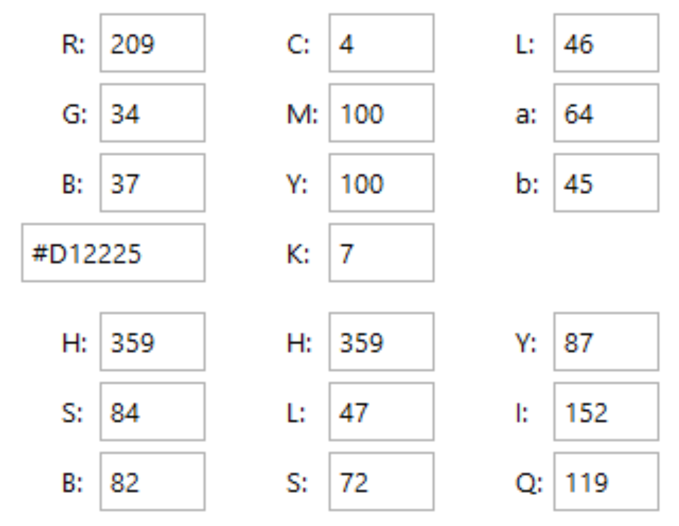
Color Palette Strategy
The identity for Sitka utilizes a vibrant gradient of reds, transitioning from a deep, rich crimson at the base to a brighter, energetic red at its apex. This choice is highly intentional:
Passion and Creativity: Red is globally recognized as the color of passion, energy, and creativity—the very heart of innovative interior design.
Growth and Aspiration: The gradient effect, moving from darker to lighter tones as it ascends, subtly reinforces the idea of “elevation” and progression from a foundational concept to a vibrant, finished space.
Sophistication and Impact: Using a gradient rather than a flat color adds depth, dynamism, and a premium feel, reflecting the sophisticated and multi-layered nature of interior design. This palette ensures the brand is perceived as energetic, ambitious, and deeply committed to its craft.
Ready to discuss your visionary identity? Start your Strategic Logo Design Process with our experts today.