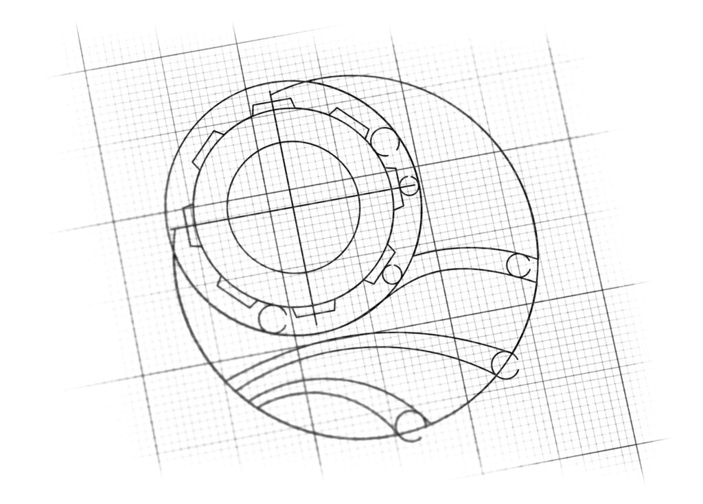
logo design for marine equipment co.
Brand Name
SDHG
Category
Marine Equipment
Year
2017
The Client
SDHG is a company specializing in Marine Equipment and Services. The brand aims to be perceived as a reliable, technically proficient provider that navigates the waters of the global marine industry with precision (Gear), movement (Waves), and forward progression (Sail).
The Challenge
The objective was to design a robust, compact, and dynamic mark that seamlessly integrates three distinct, necessary elements: technical engineering (Gear), the marine environment (Waves), and navigation/forward momentum (Sail/Crescent). The challenge lay in making the mechanical and natural elements coexist in a harmonious and trustworthy emblem.


The Solution (Our Approach)
We designed a powerful, circular emblem that achieves a visual balance between industry and nature by combining three key elements:
The Cogwheel / Gear (Technical Equipment): A prominent Orange Cogwheel (Gear) is centralized within the circular frame. This universal industrial symbol anchors the brand in engineering, mechanical precision, and equipment manufacturing. The bright orange color provides a necessary contrast and signifies energy and attention.
The Sea Waves (Marine Environment): The lower half of the circle is dedicated to stylized Deep Blue Waves. These represent the “Marine Environment,” the ocean, and the movement of the sea. The layered wave pattern communicates fluidity, depth, and the dynamic nature of the business’s operating environment.
The Sail / Crescent (Navigation and Progress): The upper right portion of the circle is formed by a sleek Gray Crescent or Sail. This element symbolizes navigation, forward movement, and optimism, implying that SDHG’s equipment helps clients successfully traverse the waters and move toward their goals. It also suggests the curved silhouette of a boat’s sail or hull.
The Outcome
The final design is a coherent, technical, and aesthetically pleasing emblem that perfectly aligns SDHG with the marine engineering sector.
The emblem strategically achieves the following:
Validates Dual Expertise: The juxtaposition of the Orange Gear and the Blue Waves visually guarantees that SDHG possesses deep expertise in both mechanical engineering and the specific challenges of the marine environment.
Communicates Forward Momentum: The angled Sail/Crescent sitting above the waves provides a strong sense of purpose and directional movement, positioning SDHG as a progressive and growth-oriented partner.
Instills Reliability: The circular containment and the solidity of the gear shape convey completeness, stability, and enduring reliability—critical attributes for equipment used in the demanding conditions of the sea.
High Contrast and Recognition: The strategic use of contrasting colors (vibrant orange against cool blues and grays) ensures high visibility and immediate recognition, making the logo highly effective on industrial equipment and corporate collateral.
Overall, the SDHG logo transforms the industry’s technical nature into a clear visual promise of Engineered Solutions that Drive Marine Success.

Color Palette Strategy
Deep Marine Blue: Represents the ocean, stability, trust, and the water environment.
Safety Orange: Used for the gear; symbolizes energy, action, attention, and the mechanical/industrial component.
Utility Gray: Used for the sail/crescent; signifies durability, engineered material, and technical competence.

Ready to discuss your visionary identity? Start your Strategic Logo Design Process with our experts today.
