logo design for premium mineral water
Brand Name
Negine Zardkooh
Category
Mineral Water
Year
2012
The Client
Negine Zardkooh is a premium mineral water brand sourcing its product from the esteemed Zardkooh (Yellow Mountain) region in Iran. The brand aims to communicate the purity and pristine source of its water while positioning itself as a valuable, high-end product (a Gem/Diamond).
The Challenge
The objective was to design a mark that elegantly fuses the imagery of the product’s origin (a mountain source) and the purity of the product (water drop) with the brand’s premium aspiration (a jewel). The challenge lay in creating a visually sophisticated symbol that conveyed clarity, value, and the natural, mountainous source without being overly literal or simplistic.


The Solution (Our Approach)
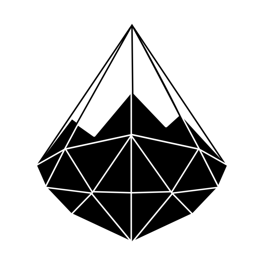
We designed a crystalline, faceted emblem that uses geometry and color gradients to merge the concepts of water, value, and altitude, based on three strategic concepts:
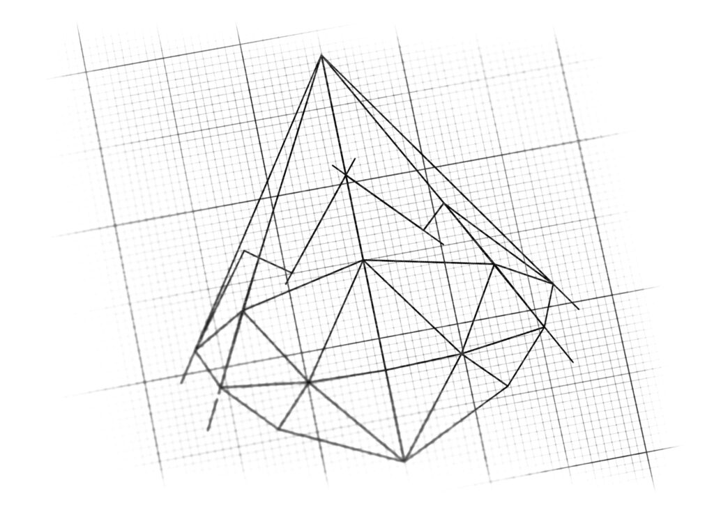
The Water Drop as a Gem (Purity and Value): The primary shape is a perfectly cut, faceted Diamond or Gemstone (Negine). This form is immediately recognizable as a symbol of exceptional value, purity, and clarity. By shaping the diamond in a tear-drop or pointed pyramidal form, it successfully represents the Water Drop at its most valuable state.
The Pyramidal Shape (The Mountain Source): The strong, upward-pointing, triangular geometry of the faceted gem subtly represents a Mountain Peak (specifically, Zardkooh). This connection links the product’s premium quality directly back to its untouched, high-altitude source in the Iranian mountains, ensuring authenticity and natural purity.
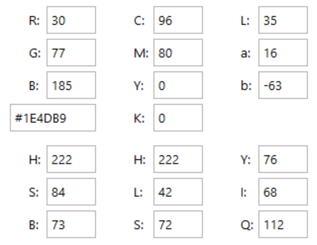
Crystalline Blue Gradients (Clarity and Coolness): The design uses multiple shades of light and deep blue, creating intricate facets and catching light like ice or clean water. This color palette reinforces the themes of coolness, refreshment, and the pristine, filtered clarity of the mineral water.
The Outcome
The final design is a concise, sophisticated, and highly effective emblem that visually communicates the premium value and natural source of the product.
The emblem strategically achieves the following:
Establishes Premium Market Position: By utilizing the Gemstone/Diamond metaphor, the logo instantly signals that Negine Zardkooh is a luxury item, differentiating it from commodity water brands and justifying its higher price point.
Authenticates the Source: The dual interpretation of the shape as both a Gem and a Mountain Peak effectively roots the brand in its natural origin (Zardkooh), providing a visual guarantee of the water’s natural filtration and quality.
Communicates Purity and Refreshment: The use of clear, icy blue tones and the highly faceted surface emphasizes the clarity, coolness, and exceptional purity of the mineral water.
High Adaptability and Impact: The strong, symmetrical, and three-dimensional structure ensures the logo is highly impactful on packaging (especially clear bottles) and retains its premium feel across all digital and print media.
Overall, the Negine Zardkooh logo transforms a simple necessity (water) into a Valuable, Mountain-Sourced Luxury (a Gem).

Color Palette Strategy
Icy Sky Blue: Used in lighter facets, symbolizing purity, clarity, and cool refreshment.
Deep Cerulean Blue: Used in darker facets and shadows, providing dimension, stability, and a sense of depth (like a deep, clean mountain spring).
White Highlights: Used to simulate light reflection on the facets, essential for the “Diamond” effect and emphasizing the crystalline structure.

Ready to discuss your visionary identity? Start your Strategic Logo Design Process with our experts today.
