logo design for renewable energy company
Brand Name
Zagros GF
Category
Green Fuel
Year
2015
The Client
Zagros Green Fuel is an energy company, likely specializing in biofuels, renewable energy sources, or highly efficient, environmentally friendly fuels. The brand’s core concept is to achieve balance (Yin and Yang) between power/energy (Flame/Fuel) and sustainability/ecology (Green Leaf).
The Challenge
The objective was to create a highly symbolic and memorable mark that immediately communicates the brand’s function—fuel/energy production—while simultaneously asserting its commitment to environmental responsibility and balance. The challenge lay in adapting the Eastern concept of Yin and Yang to Western industrial imagery (fire and foliage) without losing the message of equilibrium.


The Solution (Our Approach)
We designed a powerful, circular emblem that uses the philosophy of balance and contrast to communicate sustainable energy, based on three strategic concepts:
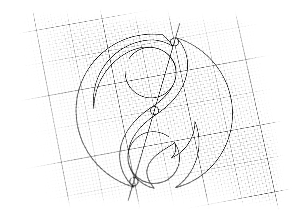
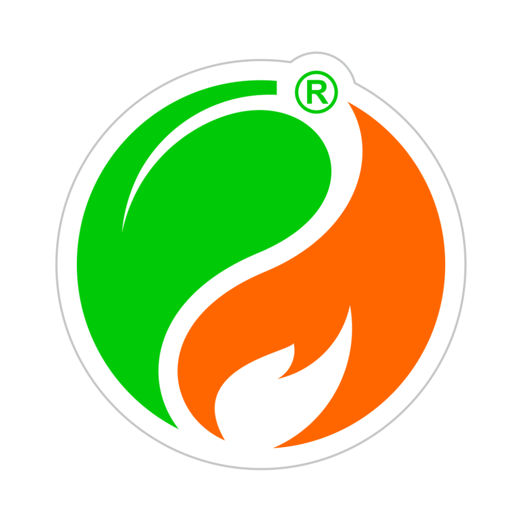
The Yin and Yang Structure (Balance and Synergy): The logo is built within a perfect circle and is divided into two interlocking, continuous halves, directly referencing the Yin and Yang symbol. This signifies the dynamic balance and synergy between the seemingly opposing forces of energy production and environmental protection—the core value of “Green Fuel.”
The Green Leaf (Sustainability): The upper half is formed by a vibrant Green Leaf or stylized foliage. This element universally represents ecology, sustainability, renewable resources, and the ‘Green’ commitment of the brand.
The Flame/Fuel (Power and Energy): The lower half is shaped like an Orange Flame or a stylized drop of fuel. This symbolizes energy, combustion, power, and the ‘Fuel’ component of the product. The continuous flow of the flame/drop interlocking with the leaf ensures that power generation is linked intrinsically to nature.
The Outcome
The final design is a concise, symbolic, and professionally executed emblem that perfectly communicates the brand’s position as a sustainable energy provider.
The emblem strategically achieves the following:
Visualizes Sustainability: The explicit use of the Green Leaf and the Orange Flame within a unified whole clearly indicates that this is a company dealing with fuel derived from sustainable or environmentally responsible sources, effectively translating the “Green Fuel” name into a visual promise.
Communicates Energy and Motion: The energetic, flowing shapes inherent in the Yin and Yang structure suggest continuous motion, dynamic energy, and operational efficiency, essential qualities for an energy company.
Instills Trust and Responsibility: The balance communicated by the overall design assures stakeholders that the company is serious about environmental responsibility and seeks a balanced approach to resource management.
High Brand Recognition: The logo is exceptionally distinctive due to its high-contrast color scheme and the use of the well-recognized philosophical structure, making it memorable across global markets.
Overall, the Zagros Green Fuel logo acts as a concise visual promise: Achieving Perfect Equilibrium (Yin/Yang) Between Power Generation (Flame) and Environmental Stewardship (Leaf).

Color Palette Strategy
Vibrant Green: Represents ecology, sustainability, freshness, and the renewable aspect of the fuel source.
Energetic Orange: Represents combustion, energy, heat, and the power delivered by the fuel product.
Neutral Gray Outline: The subtle outline provides stability, professionalism, and defines the boundary of the emblem, ensuring the vibrant colors remain contained and focused.

Ready to discuss your visionary identity? Start your Strategic Logo Design Process with our experts today.
