
The Foundation of Urban Grandeur Logo
Brand Name
Fan Omran
Category
construction
Year
2012
The Client
Fan Omran is a major construction and engineering firm specializing in large-scale urban development projects, including high-rise commercial buildings, sophisticated infrastructure, and major residential complexes. They are known for their ability to deliver complex, high-quality structures.
The Challenge
The construction industry requires a logo that conveys two seemingly contradictory values: unwavering stability and reliability (the foundation), and architectural ambition (the height and scale of modern projects). Fan Omran needed an identity that was not only strong and masculine but also visually suggested the transformation from groundwork to soaring cityscapes. The challenge was to integrate the letter ‘F’ in a meaningful way that defined the core process of “Omran” (construction/development).


The Solution (Our Approach)
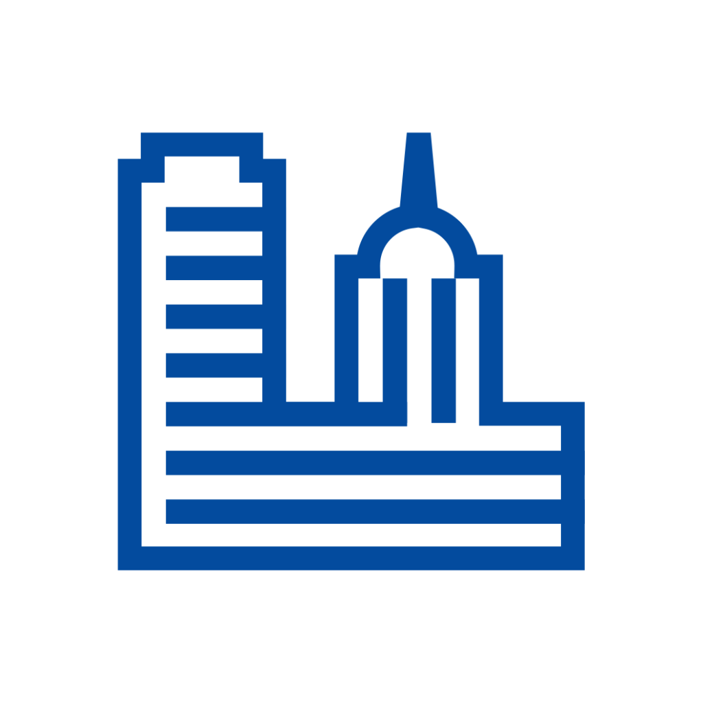
We designed a powerful, geometric monogram that conceptually represents the act of building and its final majestic result:
The Letter ‘F’ (The Foundation): The core of the design is the letter ‘F’. It is rendered horizontally (lying down), symbolizing the foundation, the blueprint, and the stable groundwork upon which all construction begins. This interpretation anchors the brand in reliability and meticulous planning.
The Architectural Blocks (Construction): The horizontal ‘F’ is composed of geometric, interlocking blocks or beams. These blocks visually suggest the complex, structural components used in major construction, emphasizing the firm’s engineering precision.
The Soaring Heights (Urban Grandeur): The negative space created by the interlocking structure, and the overall composition, strongly suggests the vertical thrust of towering skyscrapers or multiple high-rise buildings. This represents the finished, ambitious projects—the urban scale and the final achievement of the firm.
Forward Momentum: The sharp, angled edges of the blocks lend the design a sense of forward momentum and progress, signifying a company that is continually developing and moving the industry forward.
The Outcome
The Fan Omran logo is a sophisticated emblem that effectively communicates the firm’s comprehensive strength:
Dual Role Communication: It successfully conveys both the planning stage (horizontal F) and the execution stage (vertical projection), demonstrating end-to-end capability.
Professional Authority: The clean, geometric, and bold forms instantly position Fan Omran as a serious, professional player in large-scale infrastructure and development.
Memorable Monogram: It is a unique and abstract interpretation of the company’s initial, giving the brand a strong, recognizable, and enduring visual anchor.
Color Palette Strategy
Fan Omran utilizes a robust, no-nonsense palette associated with strength and permanence:
Authority Black: Used for the main structure, Black symbolizes solidity, power, authority, and professionalism. It assures clients of the brand’s unwavering commitment to quality and stability.
Industrial Grey: If a secondary color is used, a deep Industrial Grey can be applied to add texture or highlight key areas. Grey represents engineering, technology, and durable materials like steel and concrete.
This monochromatic or near-monochromatic palette ensures the brand is perceived as serious, dependable, and focused squarely on engineering excellence and lasting quality.
