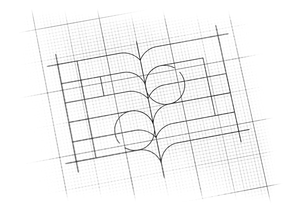
logo design for online education academy
Brand Name
EUTCA
Category
Online Education
Year
2017
The Client
Eutca is an Online Education Academy dedicated to providing specialized learning content. The brand’s philosophy is rooted in the belief that knowledge is the fundamental driver of personal development and expansion. The name Eutca needs a memorable mark that communicates education, quality content, and growth.
The Challenge
The objective was to create a clean, contemporary, and academic mark that clearly signals education and online learning. The key challenge was to integrate the letter ‘E’—the brand initial—with the universal symbol for knowledge (the book) in a way that visually suggests “Expansion of knowledge” or “Personal Development through learning,” maintaining a sense of professionalism and authority.


The Solution (Our Approach)
We designed a minimalist, powerful monogram that uses negative space and symmetry to merge literacy and identity, based on three strategic concepts:
The Open Book (Knowledge and Learning): The horizontal structure is unmistakably that of an open book, with the central vertical split forming the binding and the horizontal lines representing the pages. This immediately anchors Eutca in the educational sector.
The Monogram ‘E’ (Brand Identity): The entire form is a cleverly abstracted and stylized capital letter ‘E’. The horizontal lines that form the pages simultaneously serve as the upper, middle, and lower strokes of the letter ‘E’. This creates a high degree of brand recognition without being overly literal.
Visual Extension and Development: The clean, blocky, and expanded shape of the monogram visually suggests “Extension” or “Development,” fulfilling the client’s desire to communicate that learning leads to personal growth. The wide, balanced stance of the mark implies stability and comprehensive knowledge.
The Outcome
The final design is a concise, symmetrical, and powerful emblem that perfectly captures the brand’s mission.
The emblem strategically achieves the following:
Reinforces Core Mission: The direct yet stylized representation of the Open Book instantly communicates Eutca’s function as an Online Education Academy, making its purpose clear to potential learners.
Communicates Development and Scope: The wide, block-like structure and the distinct, parallel lines suggest “The Expansion of Knowledge” and the structured, step-by-step nature of personal development achieved through Eutca’s programs.
Achieves High Memorability: The seamless integration of the letter ‘E’ with the classic book form creates an elegant and memorable monogram that is highly recognizable and professional, suitable for a digital learning platform.
Instills Trust and Authority: The use of a bold, solid geometric shape and a deep blue color palette conveys stability, trust, and academic rigor, essential qualities for an effective online learning institution.
Overall, the Eutca logo acts as a concise visual promise: structured learning (Book) leads to personal and professional expansion (Stylized ‘E’ and wide form).

Color Palette Strategy
Deep Academic Blue (Trust, Intelligence, and Stability): The exclusive use of a deep, solid blue is strategic. Blue is universally associated with intelligence, competence, and reliability, making it the ideal choice for an academy focused on serious, lasting educational impact. The single color choice enhances the logo’s modern simplicity and strength.

Ready to discuss your visionary identity? Start your Brand Logo Design Process with our experts today.
