logo design for natural beverage brand
Brand Name
Dreame One
Category
Explosive Taste
Year
2019
The Client
Dream one is a beverage producer specializing in unique drinks with fresh, natural ingredients. The brand’s core promise is to deliver a thrilling experience and the joy of discovering new flavors. The logo needs to embody excitement, natural vitality, and a playful, energetic aesthetic.
The Challenge
The objective was to design a mark that visually communicates the “excitement and newness of flavor” through dynamic elements, while firmly grounding the product in the “natural and healthy” category. The challenge lay in balancing the chaotic energy of the flavor burst with the clean assurance of natural ingredients.


The Solution (Our Approach)
We designed a vibrant, energetic logotype where the brand name is the focal point, surrounded by an explosion of color and shape, based on three strategic concepts:
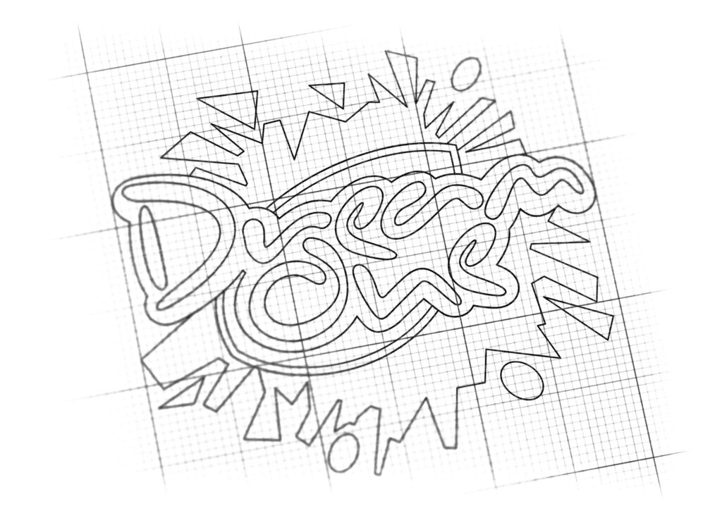
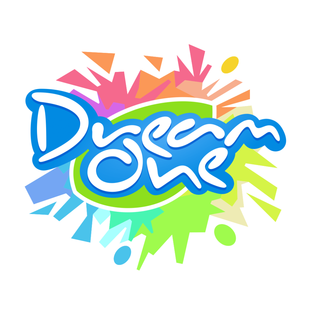
The Playful Logotype (Joy and New Experience): The brand name, “Dream one,” is rendered in a smooth, bubbly blue and white font. The fluid, energetic shape of the text conveys joy, playfulness, and the exciting new experience of the flavors.
The Exploding Elements (Flavor Excitement): The background features a chaotic yet controlled burst of colorful, fragmented elements. These represent the “Thrilling elements being spread” and the “Explosion of taste” consumers experience with every sip. The varied, bright colors hint at the diversity and complexity of the natural flavor combinations.
The Green Foundation (Health and Nature): A Green, leaf-shaped or oval foundation is placed directly behind the text. This crucial element symbolizes the “Natural and Healthy” ingredients of the beverages. It acts as the anchor, assuring consumers that the excitement is rooted in natural goodness.
The Outcome
The final design is an energetic, highly appealing, and memorable logotype that perfectly communicates the brand’s focus on innovative, healthy, and exciting beverages.
The emblem strategically achieves the following:
Communicates Experiential Value: The dynamic, exploding elements immediately convey that the product offers more than just refreshment—it’s an “experience of new flavors”—making it highly appealing to consumers seeking adventurous options.
Balances Fun and Health: The fusion of the playful blue text and the chaotic color burst with the grounding Green leaf shape successfully balances the promise of excitement with the assurance of natural, healthy ingredients.
High Brand Recognition: The strong, central logotype ensures the brand name is the immediate focus, while the surrounding visual energy makes it instantly recognizable in highly saturated retail environments.
Signals Product Vitality: The overall use of vibrant, high-energy colors (blue, green, orange, pink) visually represents the freshness and vitality of the natural ingredients used in the drinks.
Overall, the Dream one logo acts as a concise visual promise: Natural Vitality (Green) Leads to an Explosive and Joyful Flavor Experience (Color Burst and Bubbly Text).

Color Palette Strategy
Vibrant Blue: Used for the main text; signifies freshness, coolness, and trust in the beverage category.
Anchor Green: Used for the underlying shape; establishes the natural, healthy, and organic source of the ingredients.
Multi-Color Burst: A wide spectrum of contrasting colors (Yellow, Orange, Pink, Light Blue) is used to represent excitement, variety, and the “explosion” of diverse flavors.

Ready to discuss your visionary identity? Start your Strategic Logo Design Process with our experts today.
