logo design for paper manufacturing B2B
Brand Name
Diamond
Category
Papers
Year
2010
The Client
Diamond Paper is a brand specializing in the manufacturing and trading of high-quality paper and paper stock. They cater to B2B clients in printing, publishing, and packaging industries who require durable, consistent, and premium materials.
The Challenge
In a market often viewed as a commodity, Diamond Paper needed a brand identity that immediately transcended basic function and communicated uncompromising quality, durability, and intrinsic value. The challenge was to integrate the universal symbol for value—the diamond—with the core product—paper—in a way that felt authoritative and promised superior performance and longevity, appealing directly to businesses that rely on their materials for quality output.


The Solution (Our Approach)
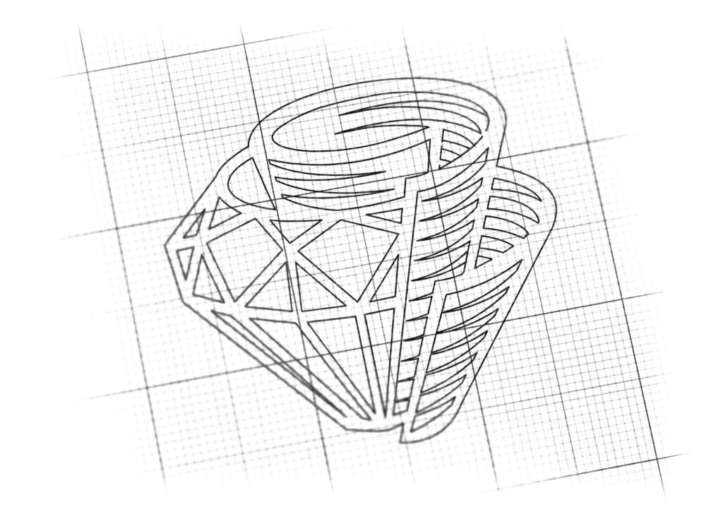
We designed an emblem that powerfully fuses the literal representation of paper with the metaphorical representation of value .
The Diamond (Quality and Durability): The primary visual anchor is a prominent, multifaceted diamond shape. This universally recognized symbol immediately communicates the brand’s commitment to premium quality, exceptional hardness, clarity, and lasting value. It serves as a visual guarantee of the paper stock’s superior characteristics.
The Rolled Paper (The Industry): Intertwined with and supporting the diamond are stylized rolls of paper. These conical scrolls directly reference the product and the material itself, ensuring the industry is clearly defined. The rolls suggest abundance, continuous supply, and the foundation upon which the value (the diamond) is built.
The Conceptual Integration: The design is strategically constructed so that the paper rolls appear to be both protecting and presenting the central diamond. This signifies that the company’s paper products are the most valuable component in the client’s creative process, and that the quality is preserved and prioritized.
Dynamic and Dimensional Aesthetic: The use of clear line work for the paper and faceted geometry for the diamond creates a strong, dimensional mark, reflecting the firm’s solidity and reliable structure.
The Outcome
The Diamond Paper emblem is a highly effective mark that successfully solves the branding challenge:
Clear Value Proposition: It instantly communicates that the product is the “diamond standard” of paper—guaranteeing superior durability and quality.
Memorable Authority: The distinctive, iconic mark creates strong recall and positions Diamond Paper above competitors using generic or basic industry symbols.
Versatility for B2B: The robust, balanced structure is ideal for use on large-scale packaging, watermarks, and technical specifications, reinforcing professionalism and authority in the trade.

Color Palette Strategy
The Diamond Paper identity uses a clean, powerful, dual-color palette:
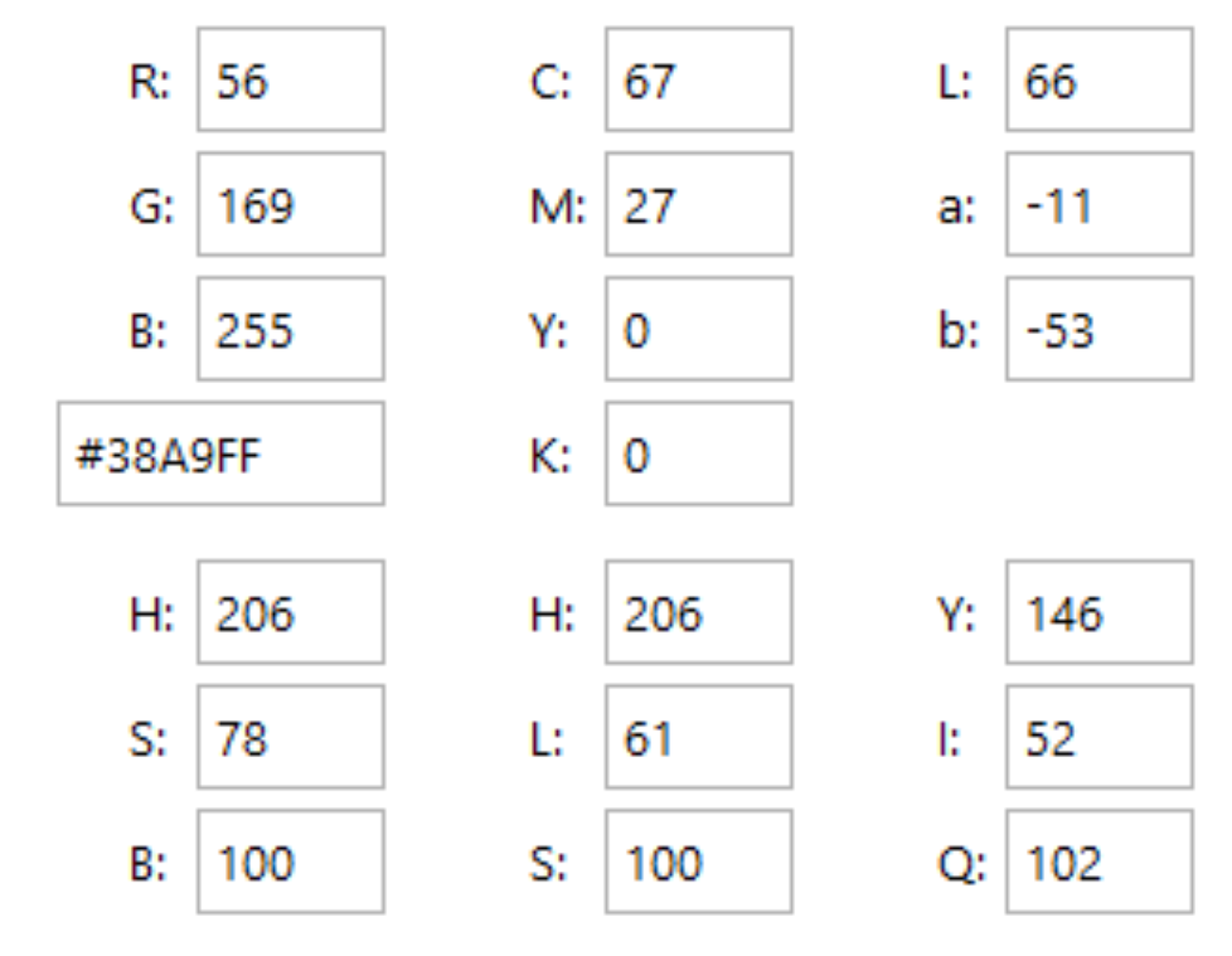
Clarity Blue (for the Diamond): A bright, cool blue is used for the diamond itself. Blue in this context represents precision, trust, and clarity—essential qualities for printing and design. It also evokes the purity and brightness of high-quality paper stock.
Industrial Grey (for the Paper Rolls): The paper rolls are rendered in professional shades of Grey and White. Grey symbolizes reliability, manufacturing, and industrial strength, grounding the brand in its role as a stable producer and supplier.
This palette ensures the brand is perceived as reliable, professional, and dedicated to delivering materials of the highest clarity and standard.

Ready to discuss your visionary identity? Start your Professional Logo Design Process with our experts today.
