Fried Chicken & Fast Food Logo Design
Brand Name
Chitir Chicken
Category
Fast Food
Year
2011
The Client
Chitir Chicken is a fast-food brand specializing in fried chicken and a variety of quick-service restaurant (QSR) offerings like burgers and pizzas. The brand aims to be known for its delicious taste, speedy service, and guaranteed customer satisfaction.
The Challenge
In the highly competitive and visually noisy fast-food sector, Chitir Chicken needed a logo that would be instantly recognizable, playful, and visually communicate three things simultaneously: the core product (chicken), the customer experience (satisfaction), and the breadth of the menu (pizza/burger). The challenge was to integrate these disparate elements into a single, cohesive, and endearing character that was versatile for signage, packaging, and digital media.

The Solution (Our Approach)
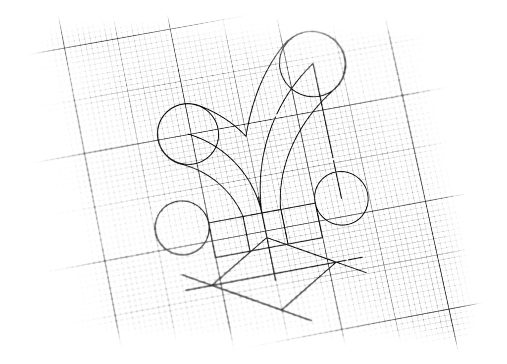
We designed a minimalist yet highly expressive mascot icon that captures the essence of the brand and its menu through smart use of geometric shapes :
The Playful Chicken Face: The overall arrangement of the shapes creates a charming, front-facing chick/chicken head, which immediately links the brand to its main product—fried chicken.
The Tick of Satisfaction (The Comb/Crown): The stylized comb or crown atop the head is shaped like a bold Checkmark (✔). This element strategically serves two functions: it adds a fun, cartoonish flair to the chick’s appearance, and more importantly, it directly symbolizes guaranteed customer satisfaction, quality confirmation, and happiness.
The Eyes as Menu Icons: The two circular “eyes” are conceptually linked to other key menu items. While functioning as eyes, these circles are designed to visually represent the typical round shapes of Pizzas and Burgers, subtly broadening the consumer’s perception of the menu offerings.
The Takeout Beak (The Packaging): The lower, diamond-shaped element that forms the chick’s beak is a clever visual cue for the takeout box. The diamond/rhombus shape is reminiscent of a folded, tapered box, signaling speed and convenience—that the food is delicious and ready for takeout/delivery.
The Outcome
The Chitir Chicken logo is a brilliant example of a strategic mascot that delivers multiple brand messages in a concise and memorable form:
High Memorability: The playful, distinct character is ideal for social media and signage, ensuring high recall.
Integrated Messaging: The logo strategically communicates the core product (Chicken), the brand promise (Satisfaction via the Checkmark), and the service model (Takeout via the Beak), all within a single icon.
Appetizing and Energetic: The simple, bold shapes and warm color palette generate a feeling of excitement and hunger, which is crucial for the QSR environment.

Color Palette Strategy
Chitir Chicken utilizes the high-impact, appetite-stimulating colors dominant in the fast-food industry:
Appetizing Red (for the Tick/Crown): Red is the most aggressive color in QSR, symbolizing energy, speed, and appetite. It draws immediate attention and increases heart rate, stimulating hunger and action (making a purchase).
Warm Orange/Yellow (for the Eyes/Beak): Orange and Yellow tones are used for the secondary elements (the eyes and beak). These colors represent friendliness, warmth, and the golden, crispy texture of perfectly fried chicken. This combination maximizes appeal and reinforces the brand’s fast, tasty, and satisfying promise.