logo design for healthcare products
Brand Name
Careit
Category
healthcare
Year
2009
The Client
Careit Group is a brand dedicated to providing medical and healthcare products and services. They operate on the principle of offering comprehensive, multi-faceted care, aiming for reliable support across various medical needs and technological solutions.
The Challenge
The healthcare sector requires brands to communicate two vital messages simultaneously: empathy and trust (Care), and innovation and precision (Technology/IT). Careit Group needed a logo that visually represented not just the medical field (the “+” sign), but specifically their unique selling proposition: all-encompassing (360-degree) support and modern, structured methodology. The challenge was to transform the traditional, flat medical symbol into a dynamic, complex, and future-forward mark.


The Solution (Our Approach)
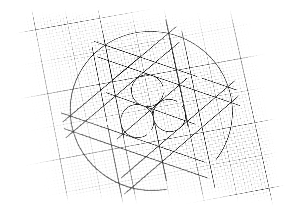
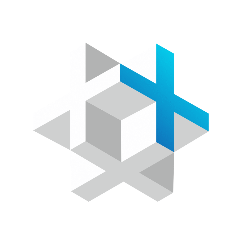
We designed a sophisticated, isometric logomark that utilizes geometric structure and perspective to symbolize comprehensive, structured care .
The Medical Plus (+): The core of the identity is the plus sign (+), the universal symbol for medicine, aid, and positive care.
The Multi-Directional Structure (Comprehensive Care): The logo is built using isometric projection (3D cubes and planes). This technique strategically positions the plus sign not just on a single plane, but as an element integrated into a complex, multi-dimensional geometric structure. This visual arrangement powerfully signifies:
All-Encompassing Support: The different sides of the structure suggest the “+” extends into multiple directions and dimensions, symbolizing the brand’s commitment to 360-degree, holistic care.
Foundation and Technology: The structure represents the stable foundation and advanced, structured methodology (referencing IT/technology architecture) that underpins their care services.
Precision and Clarity: The clean lines, sharp angles, and geometric purity emphasize precision, reliability, and modern competence—crucial factors for a medical brand.
The Outcome
The Careit Group logo successfully modernizes the traditional medical symbol and establishes a strong visual identity:
Dual Message Delivery: The logo communicates both the “Care” (the Plus) and the “IT” or structured expertise (the geometric architecture) inherent in the brand name.
Professional Authority: The sophisticated 3D structure positions Careit as a modern, reliable, and expertly managed group, appealing to both B2B partners and consumers seeking advanced healthcare solutions.
Visualizing the USP: It provides a memorable visual explanation of their key value: care that covers every angle.

Color Palette Strategy
The Careit Group palette is designed for maximum trust and clinical authority:
Clinical Blue (for the Plus Sign): A bright, clear blue is used to emphasize the active medical sign. Blue is the most trusted color in healthcare, symbolizing trust, reliability, hygiene, and technological competence.
Neutral Grey (for the Structure): The geometric foundation is rendered in various shades of Cool Grey and White. Grey symbolizes stability, professionalism, and the high-tech, structured infrastructure that supports their services.
This combination ensures the brand is perceived as a highly reliable, precise, and ethically grounded provider of comprehensive healthcare.

Ready to discuss your visionary identity? Start your Strategic Logo Design Process with our experts today.
