logo design for smart home automation
Brand Name
Hinava
Category
Smart Home
Year
2015
The Client
Hinava is a cutting-edge service specializing in high-end smart home automation (Home Automation and Smart Living). They provide integrated systems for security, climate control, lighting, and entertainment, focusing on creating seamless, intuitive, and future-ready living spaces for the discerning, modern homeowner.
The Challenge
The smart home industry faces a persistent branding problem: logos are often either too literal (showing a simple house icon) or too cold and technical (generic circuit board graphics). Hinava needed an identity that could simultaneously communicate advanced wireless connectivity, architectural integration, and high-end security without sacrificing aesthetic appeal. The key challenge was to create a mark that visually resolved the abstract nature of Wi-Fi signals with the tangible form of a modern, luxury building, positioning Hinava not just as a service provider, but as an essential element of contemporary design.


The Solution (Our Approach)
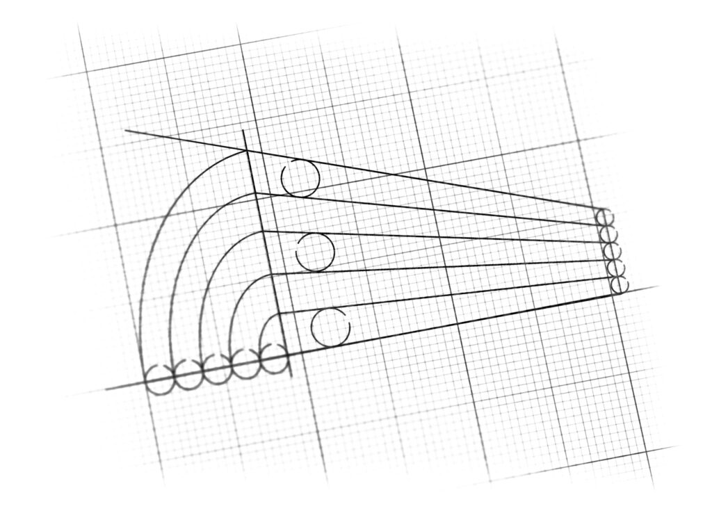
We created a dynamic and highly conceptual logomark that ingeniously fuses digital concepts with physical form using linear perspective .
The Wi-Fi Signal (Seamless Communication): The fundamental element is the series of concentric, curved arcs that visually represent a reliable wireless broadcast. Crucially, the layers of blue (as detailed in the color strategy) communicate the strength and depth of the signal, ensuring reliability is perceived visually.
The Modern Architecture (The Physical Grounding): The curves transition into sharp, parallel lines using 3D perspective. This transformation renders the logo as a streamlined, futuristic structure—a visual metaphor for a modern home. The use of perspective was strategic: it conveys depth, forward motion, and a forward-thinking brand that looks beyond the present.
The Fusion of Form and Function: The final mark is a unique blend where the digital signal IS the building, powerfully symbolizing that technology is not an addition to the home, but its very foundation and structure.
The Outcome
The Hinava logo successfully bridges technology and lifestyle, providing the client with an identity that:
Elevates Brand Perception: It is sophisticated enough for luxury architectural firms and interior designers, positioning Hinava as a design-centric tech partner, not just an installer.
Intuitive Communication: It instantly communicates “wireless technology for modern homes” without any accompanying text, which is vital for global brand recognition.
Superior Scalability: The geometric design ensures high fidelity across all mediums, from tiny app icons (where the lines still retain their clarity) to large-scale installation signage.
Future-Proofing: The abstract, futuristic quality of the design avoids dated visual trends, ensuring the brand remains relevant as smart home technology continues to evolve.

Color Palette Strategy
Hinava utilizes a precise spectrum of Sky and Digital Blues (ranging from light, airy blue for the periphery to a deep, grounded tone for the core). Blue is the global color for trust, security, and technology. The strategic graduation of shades is deliberate: the varying tones represent the strength and reach of the wireless signal—the signal emanates powerfully from the stable core and radiates outward. This reinforces the brand as a reliable, high-tech provider of secure and seamless home solutions.

Ready to discuss your visionary identity? Start your Custom Logo Design Process with our experts today.
