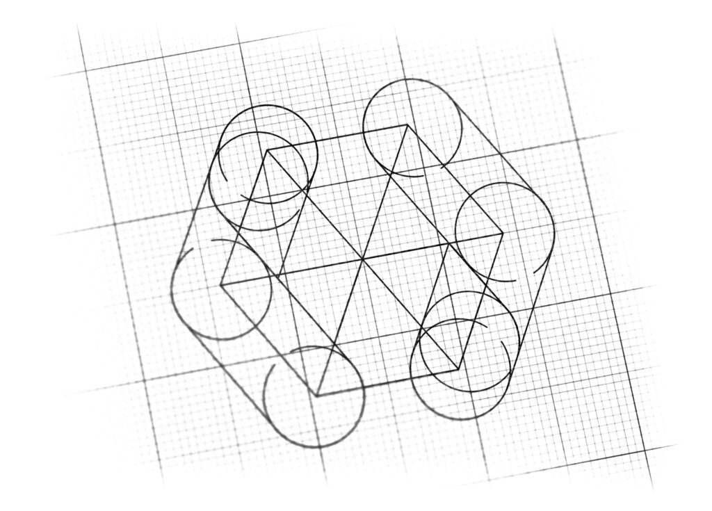
logo design for trading and commercial co
Brand Name
Pirooz Tejarat
Category
Commercial
Year
2019
The Client
Pirooz Tejarat is a Commercial/Trading Company specializing in transactions, logistics, or brokerage. The brand’s core concept is to visually represent successful “Give and Take” or exchange (Trade), where the central focus is on a valuable commodity (Gold Package), ultimately guaranteeing a successful outcome (Pirooz/Victorious).
The Challenge
The objective was to create a modern, professional mark that seamlessly visualizes the act of commercial exchange and reciprocal trust. The design needed to combine the abstract elements of arrows/hands (representing transaction) with the concrete value of the commodity (Gold) to communicate efficiency and profitability in trade.


The Solution (Our Approach)
We designed a powerful, symmetrical, three-dimensional emblem that uses metallic colors and form to represent transaction and value, based on three strategic concepts:
The Interacting Forms (Arrows/Hands): Two curved, stylized forms (in dark gray/silver) face each other, creating a dynamic, mirrored design. These elements symbolically represent the “Two Arrows” of forward momentum or the “Two Hands” engaging in a handshake or trade. They convey direct, symmetrical trade, partnership, and successful completion of a transaction.
The Central Gold Commodity (Value): Held securely between the two gray forms is a central, faceted Golden Hexagon/Cube. This represents the “Valuable Commodity/Package” being exchanged. The gold color and 3D rendering symbolize high value, profitability, wealth, and the premium nature of the goods or services Pirooz Tejarat deals in.
Encapsulation and Security: The way the two gray forms embrace the gold center suggests protection, security, and reliable handling of the valuable asset throughout the commercial process. This instills trust in clients dealing with high-value goods.
The Outcome
The final design is a sophisticated, strong, and highly professional emblem that perfectly communicates the brand’s function in high-value commerce.
The emblem strategically achieves the following:
Visualizes Successful Exchange: The interaction between the two gray forms and the enclosed gold item clearly represents the concept of “Trade and Give-and-Take,” immediately positioning the company as a key facilitator of commerce.
Guarantees Profitability: The dominant Gold color assures clients that their dealings with Pirooz Tejarat will result in high value and successful, profitable outcomes (Pirooz/Victorious).
Communicates Trust and Security: The solid, metallic 3D rendering and the protective posture of the flanking forms convey a strong sense of reliability, security, and professional handling—critical for commercial logistics.
Modern Industrial Appeal: The use of clean, rounded metallic forms gives the logo a sleek, modern, and industrial feel, appealing to professional B2B clients who value efficiency and high-tech solutions.
Overall, the Pirooz Tejarat logo acts as a concise visual promise: Secure and Reliable Trade (Hands/Arrows) Guarantees Maximum Value and Success (Gold).

Color Palette Strategy
Prestige Gold/Yellow: Used for the center; symbolizes wealth, value, premium quality, and success, aligning with the “valuable package.”
Utility Gray/Silver: Used for the flanking forms; symbolizes stability, professional service, engineering precision, and reliability in handling the commercial transactions.
Dark Shadows: Used to enhance the 3D, metallic effect, making the gold and silver look tangible and high-end.

Ready to discuss your visionary identity? Start your Strategic Logo Design Process with our experts today.
