logo design for tailoring and apparel brand
Brand Name
Rees
Category
Tailoring Precision
Year
2010
The Client
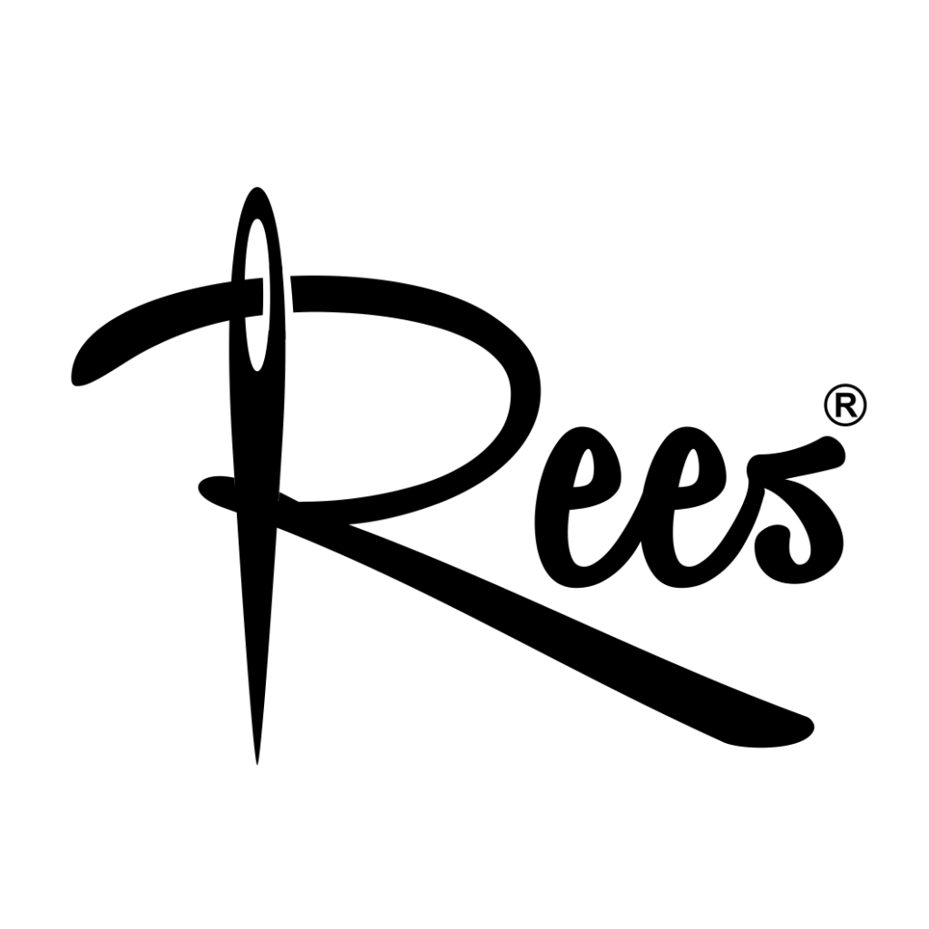
Rees is a brand specializing in Clothing Design and Tailoring (Designing and Sewing Apparel). The brand’s core concept is to visually express its identity by integrating the initial letter of the brand name, ‘R’, with the foundational tools of its craft: the needle and thread. The aim is to convey creativity, precision, and a strong connection to the art of tailoring.
The Challenge
The objective was to design a fluid, memorable logotype that seamlessly transforms the abstract letter ‘R’ into the functional imagery of a needle and thread. The challenge lay in achieving this transformation elegantly—using the thread as the main visual element of the letter—while maintaining high legibility of the brand name, Rees.


The Solution (Our Approach)
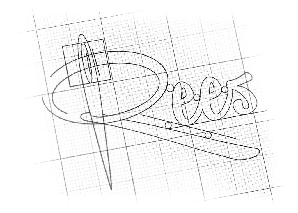
We designed a dynamic logotype that uses the initial letter ‘R’ as a piece of curved thread, based on three strategic concepts:
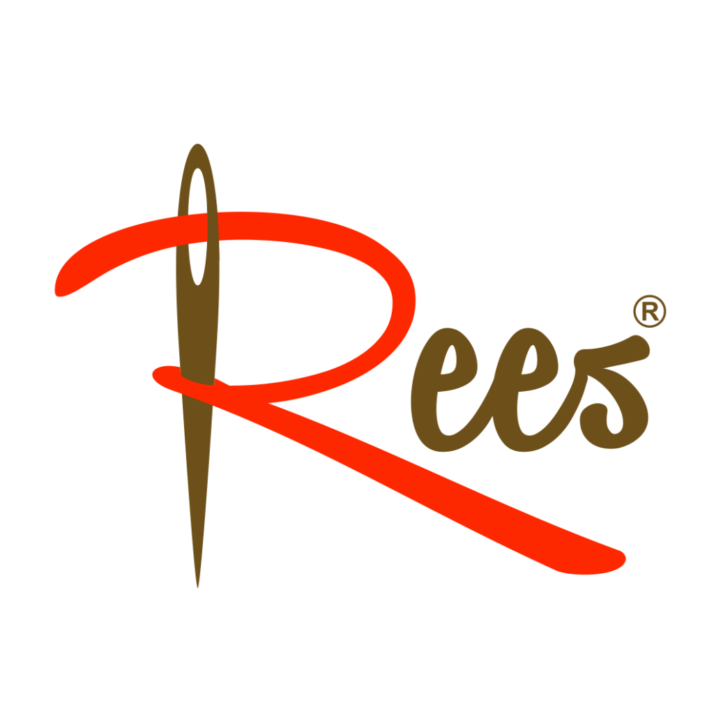
The Thread as the Letter ‘R’ (Integration and Flow): The initial letter ‘R’ is stylized as a thick, Orange Curved Line. This line explicitly represents a piece of Thread and creates a sense of continuous flow and motion, symbolizing the continuous process of design and sewing.
The Needle (Precision and Craft): A realistic Tailor’s Needle is vertically positioned, piercing the upper part of the orange ‘R’. This powerful element immediately anchors the brand in the tailoring and apparel industry, signifying precision, expert craftsmanship, and the actual act of sewing.
The Fluid Logotype (Style and Modernity): The rest of the letters, ‘ees’, are rendered in a slightly cursive, modern gray font that complements the dynamic orange ‘R’. This ensures the brand name is clearly visible while the initial letter acts as the strong, iconic symbol. The combined flow suggests a brand that is both traditional in skill and modern in style.
The Outcome
The final design is a concise, industry-specific, and highly creative logotype that perfectly communicates the brand’s connection to design and tailoring.
The emblem strategically achieves the following:
Directly Communicates Industry: The inclusion of the Needle and the Thread-like ‘R’ instantly positions Rees as a clothing design and tailoring expert, making its function clear to potential customers.
Achieves High Memorability: The unique transformation of the initial letter ‘R’ into a recognizable tool of the trade creates an exceptionally memorable and distinctive brand mark that is easily recalled.
Signals Precision and Care: The combination of the sharp Needle and the controlled, smooth flow of the Thread suggests meticulous attention to detail, precision sewing, and high-quality construction of the final apparel.
Balanced Aesthetic: The contrast between the energetic Orange thread and the stable Gray lettering provides a balanced aesthetic, showing that Rees is a brand that combines creative vitality with reliable, professional service.
Overall, the Rees logo acts as a concise visual promise: The Art of Tailoring (Needle) Integrated into Brand Identity (Thread ‘R’).

Color Palette Strategy
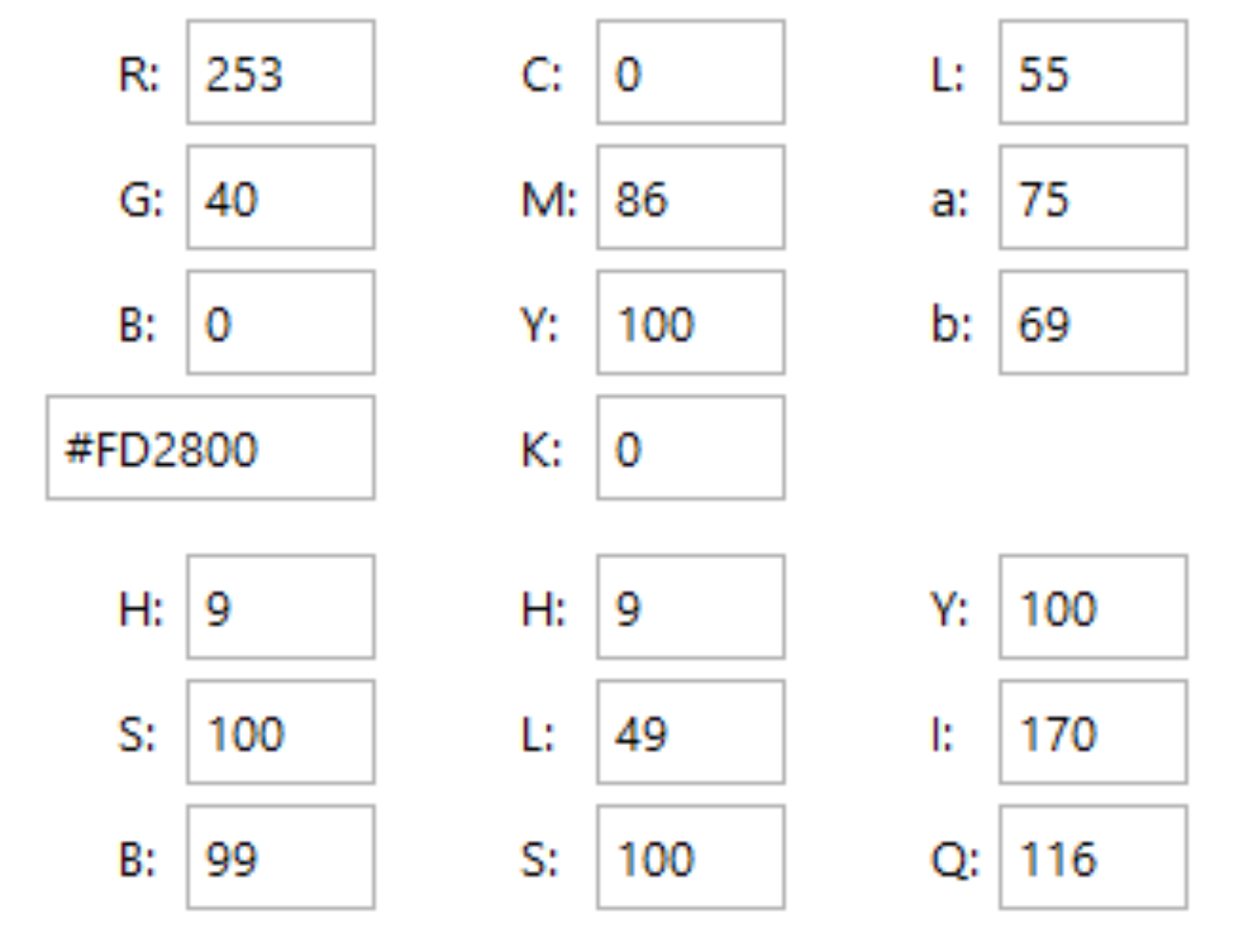
Vibrant Orange: Used for the thread/’R’; symbolizes energy, creativity, warmth, and visibility, making the key iconic element stand out.
Classic Gray: Used for the needle and the remaining letters; symbolizes professionalism, stability, industrial quality, and timeless style, grounding the brand in tradition.

Ready to discuss your visionary identity? Start your Professional Logo Design Process with our experts today.
