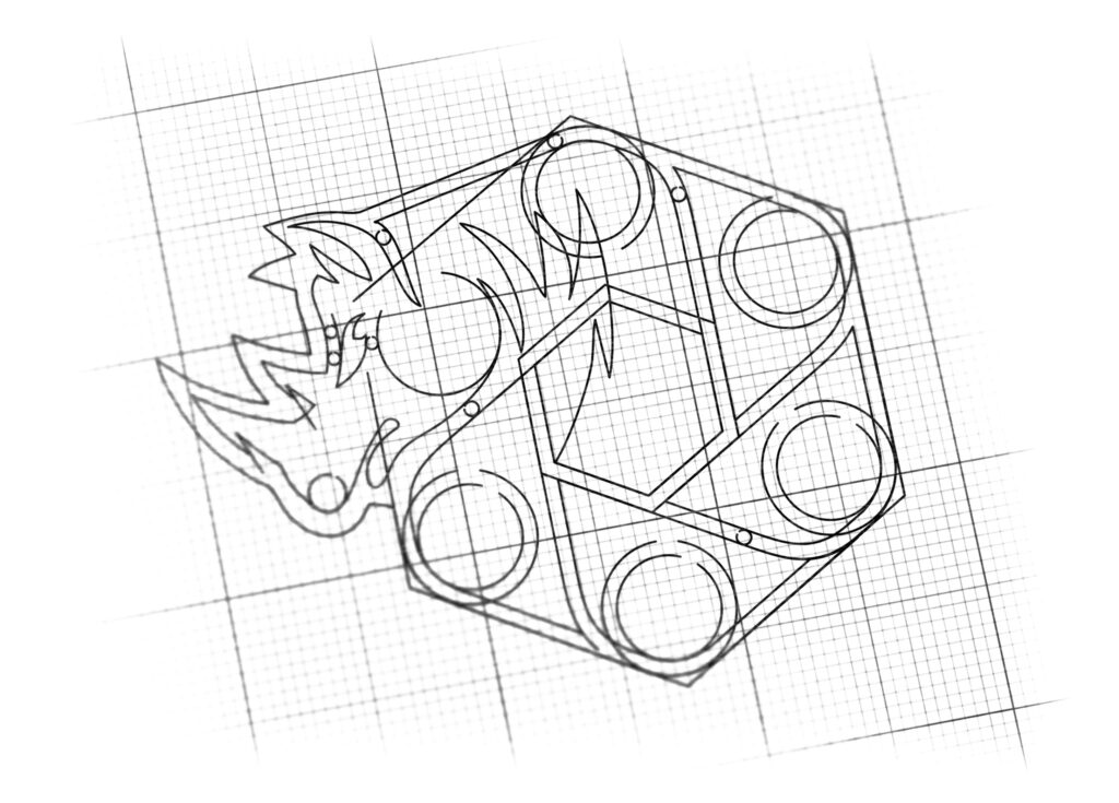
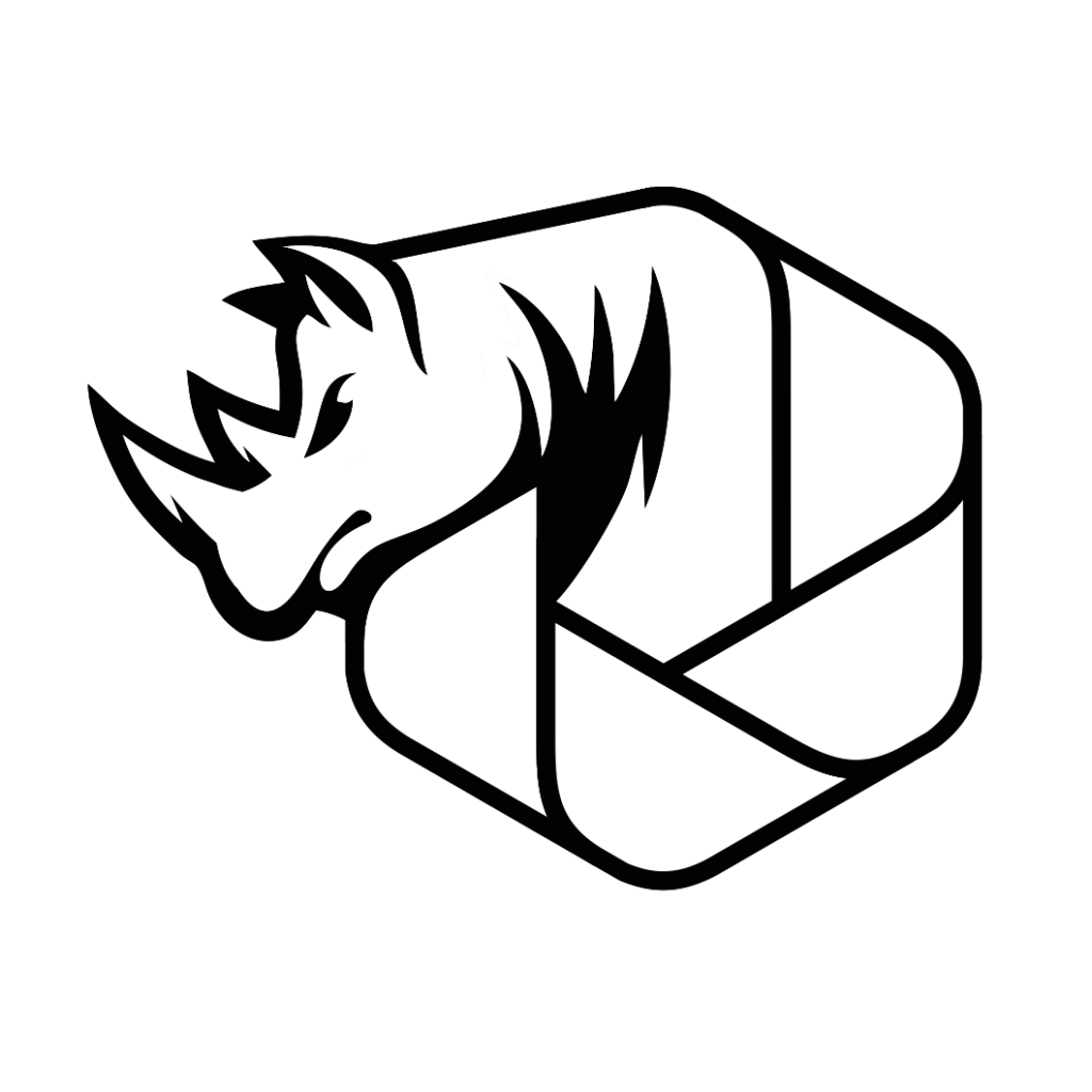
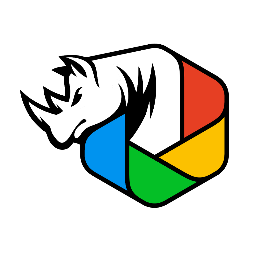
logo design for paint and coatings manufacturer
Brand Name
Esperlus
Category
Paint Manufacturing
Year
2016
The Client
Esperlus is a manufacturer of Paints and Coatings. The brand’s core promise is to deliver products with superior strength, thick coverage, and extreme durability. The logo needs to embody resilience and a wide spectrum of color options, appealing to industrial and consumer markets that prioritize quality and protection.
The Challenge
The objective was to create a highly memorable and aggressive mark that simultaneously communicates two distinct concepts: impenetrable strength and longevity (the Rhinoceros) and the brand’s core product functionality—color and finish (the Color Palette). The challenge lay in integrating the raw power of the animal with the geometric precision of color technology.


The Solution (Our Approach)
We designed a powerful emblem that juxtaposes an aggressive natural form with a technical geometric shape to convey durability and variety, based on three strategic concepts:
The Rhinoceros (Durability and Protection): The left side of the logo features the detailed head and horn of a Rhinoceros. This animal is the universal symbol for “Thick, Strong, and Durable Coating” and unyielding resilience. Its white color keeps the focus on its form, while the black outline adds definition and strength.
The Color Palette Hexagon (Product Variety): The rhinoceros is integrated with a multi-colored Hexagonal Shape. This polygon is composed of four distinct color segments (Blue, Green, Yellow, Red) representing a “Color Palette” and the wide variety of available paint colors and finishes offered by Esperlus. The hexagonal shape also hints at chemical structure and industrial stability.
Integration (Superior Coverage): The rhinoceros appears to be emerging from or protecting the geometric color field. This fusion symbolizes that the brand’s Durability (Rhino) is applied directly to the Color (Palette), promising clients a coating that is both vibrant and exceptionally tough. The shape of the hexagonal cell also subtly references a camera aperture or shutter, hinting at visual clarity and light capture, crucial for high-quality paint.
The Outcome
The final design is an aggressive, professional, and unique emblem that powerfully communicates the brand’s value proposition: strength and aesthetic variety.
The emblem strategically achieves the following:
Guarantees Superior Protection: The prominent Rhinoceros head instantly assures customers of the paint’s “Thick Coverage and Long-lasting Durability,” positioning Esperlus as the tough, protective solution in the coatings market.
Communicates Product Range: The distinct, segmented Color Hexagon clearly indicates the brand’s expansive color palette and customization options, fulfilling the aesthetic need of the consumer.
High Memorability and Impact: The combination of a fierce animal and clean geometry creates a highly distinctive and memorable mark that stands out from competitors using generic brushes or drops.
Signals Professional Quality: The clean lines and contained hexagonal shape anchor the power of the rhino in engineered quality and control, appealing to both professional painters and industrial clients.
Overall, the Esperlus logo acts as a concise visual promise: Unbeatable Strength (Rhino) Fused with Infinite Color Possibilities (Palette).

Color Palette Strategy
Monochrome Rhinoceros (Strength): White and Black are used for the rhino to emphasize its form, power, and professionalism, preventing the mascot from becoming overly playful.
Primary/Secondary Hues (Variety): The use of four strong, distinct colors (Red, Yellow, Blue, Green) in the hexagon effectively represents the full spectrum of colors and the depth of the product offering.
Ready to discuss your visionary identity? Start your Strategic Logo Design Process with our experts today.
