logo design for industrial cold storage
Brand Name
Pars
Category
Cold Storage
Year
2009
The Client
Sardkhane Sanati Miveh va Tarebar Pars (Pars Industrial Cold Storage) is a company specializing in industrial cold storage and preservation services for fresh fruits and vegetables. The brand’s core promise is to maintain the freshness, quality, and vitality of produce through precise and reliable refrigeration technology.
The Challenge
The objective was to design a highly focused, minimalist mark that instantly communicates the intersection of fresh produce (specifically fruits) and refrigeration/cold storage. The design needed to be clean and simple, blending the warmth of the product with the necessary coolness of the service in a memorable and professional manner.


The Solution (Our Approach)
We designed a minimalist, linear emblem that uses iconic symbols and contrasting colors to achieve clarity and impact, based on three strategic concepts:
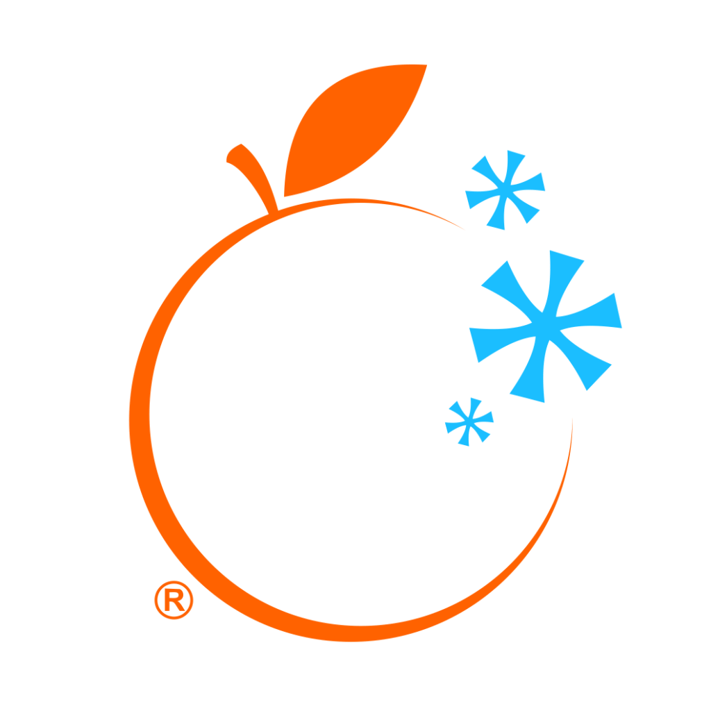
The Orange Outline (Fresh Produce): The main structure is a single, continuous orange line forming the silhouette of an Orange or Citrus Fruit. This serves as a clear, universally recognized symbol for freshness, fruit, vitality, and high-quality produce (Miveh va Tarebar). The open base suggests the circle of preservation is active and ongoing.
The Snowflakes (Refrigeration/Cold): A cluster of Blue Snowflakes is positioned outside the main fruit silhouette. This element directly symbolizes the “Cold” or “Freezing” technology (Sardkhane) that is the core service of the brand. The crisp blue color reinforces the feeling of intense cold and cleanliness.
The Contrast of Warmth and Cold (Preservation): The juxtaposition of the warm Orange (freshness) and the icy Blue (cold) visually represents the brand’s function: using cold technology to preserve warmth and freshness. This subtle tension is the essence of the cold storage business.
The Outcome
The final design is a concise, aesthetically pleasing, and highly effective emblem that immediately communicates the brand’s service and specialty.
The emblem strategically achieves the following:
Clarity of Service: The direct inclusion of the Orange and Snowflakes eliminates ambiguity, instantly positioning the brand as a specialized provider of cold storage for fruits and vegetables.
Communicates Reliability: The clean, simple lines and balanced composition convey a sense of precision and trustworthiness, essential qualities for an industrial service where reliability is paramount to protecting client assets.
High Memorability and Scalability: The reductive, single-line drawing of the fruit makes the logo highly scalable for use on cold storage facilities, transport vehicles, and professional documentation, ensuring its impact remains strong even at small sizes.
Appeals to Quality: By focusing on the fresh fruit and its preservation, the logo subtly assures clients that their produce will maintain its quality and aesthetic appeal during storage.
Overall, the Pars Cold Storage logo transforms the technical service into a simple visual promise: Precision Cold (Snowflakes) Preserves Natural Freshness (Orange).

Color Palette Strategy
Vibrant Orange: Represents freshness, energy, vitality, and the product (fruits/produce).
Icy Blue: Represents cold, refrigeration, cleanliness, and the technical infrastructure of the cold storage service.
Contrasting Leaf Green (Subtle): The small leaf provides a final touch of natural growth and organic quality against the technical blue and orange.
Ready to discuss your visionary identity? Start your Strategic Logo Design Process with our experts today.
