
logo design for health equipment brand
Brand Name
HealTest
Category
Health and Wellness
Year
2014
The Client
Healtest is a brand specializing in Health Equipment or Health Services. The brand’s core promise is to provide products that are thoroughly “checked and approved” (verified) to ensure safety, reliability, and positive health outcomes. The brand aims to be a trusted, consumer-friendly name in the wellness sector.
The Challenge
The objective was to create a warm, yet authoritative mark that immediately signals health (Heart), trust and endorsement (Checkmark), and comprehensive support (Circle). The challenge lay in merging these universal, highly recognizable symbols into a clean, modern design that is instantly associated with guaranteed quality in the health sector.
The Solution (Our Approach)
We designed a minimalist and emotionally resonant emblem that uses bold color and iconic shapes to convey trust and support, based on three strategic concepts:
The Heart Symbol (Health and Wellness): The central feature is a large, stylized Heart form. This is the universal shorthand for health, care, life, and wellness, directly placing Healtest within the health sector. The white outline provides a clean, modern aesthetic.
The Enclosing Circle (Support and Completeness): The entire design is contained within a solid circular field (vibrant pink/magenta). This circle represents “Support,” protection, completeness, and continuous care. It symbolizes the brand’s commitment to supporting the customer’s well-being comprehensively.
The Checkmark (Verification and Approval): A prominent Yellow Checkmark (Tick) is strategically placed at the bottom point of the heart. This element symbolizes “Checked and Approved,” verification, trust, and quality endorsement. It directly assures the consumer that the equipment or service has met rigorous standards.
The Outcome
The final design is a direct, emotionally appealing, and highly effective emblem that perfectly communicates the brand’s commitment to verified health solutions.
The emblem strategically achieves the following:
Instills Immediate Trust: The combination of the Heart and the definitive Checkmark is a powerful visual guarantee. It assures consumers that the brand’s products are not just health-focused but have been officially vetted and approved for safety and efficacy.
Communicates Comprehensive Support: The surrounding Circle reinforces the idea that Healtest provides full, continuous support and a complete solution for their health needs, making the customer feel protected and cared for.
Achieves High Memorability: The bold, single-color background and the high-contrast yellow checkmark against the white heart create a highly distinct, positive, and memorable visual impression, ideal for standing out in competitive retail or medical environments.
Signals Customer Focus: The choice of a vibrant pink/magenta and the heart shape adds an element of warmth, vitality, and personalized care that is often missing in purely clinical health logos.
Overall, the Healtest logo acts as a concise visual promise: Trusted Care (Heart) that is Fully Verified (Checkmark) and Comprehensively Supported (Circle).
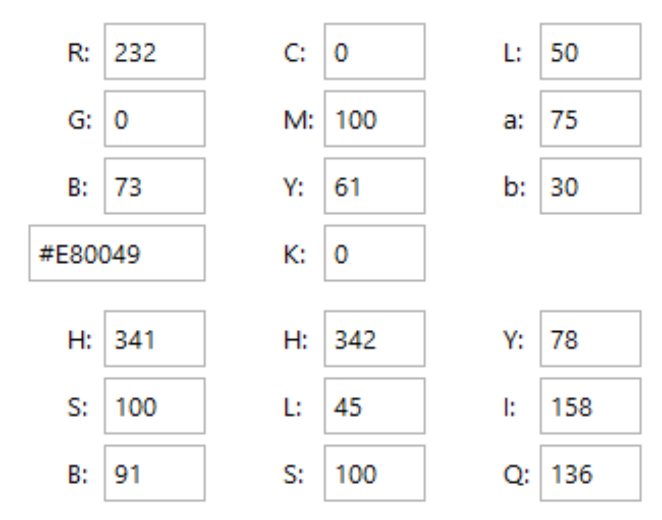
Color Palette Strategy
Vibrant Pink/Magenta: The dominant color; symbolizes vitality, energy, passion, and care, giving the brand a lively, modern, and consumer-friendly feel.
Clean White: Used for the heart outline; symbolizes purity, cleanliness, and the medical standards required in health equipment.
High-Visibility Yellow: Used for the checkmark; provides excellent contrast and specifically draws attention to the “Approved” or “Verified” status, which is the core selling point of the brand.
Ready to discuss your visionary identity? Start your Custom Logo Design Process with our experts today.