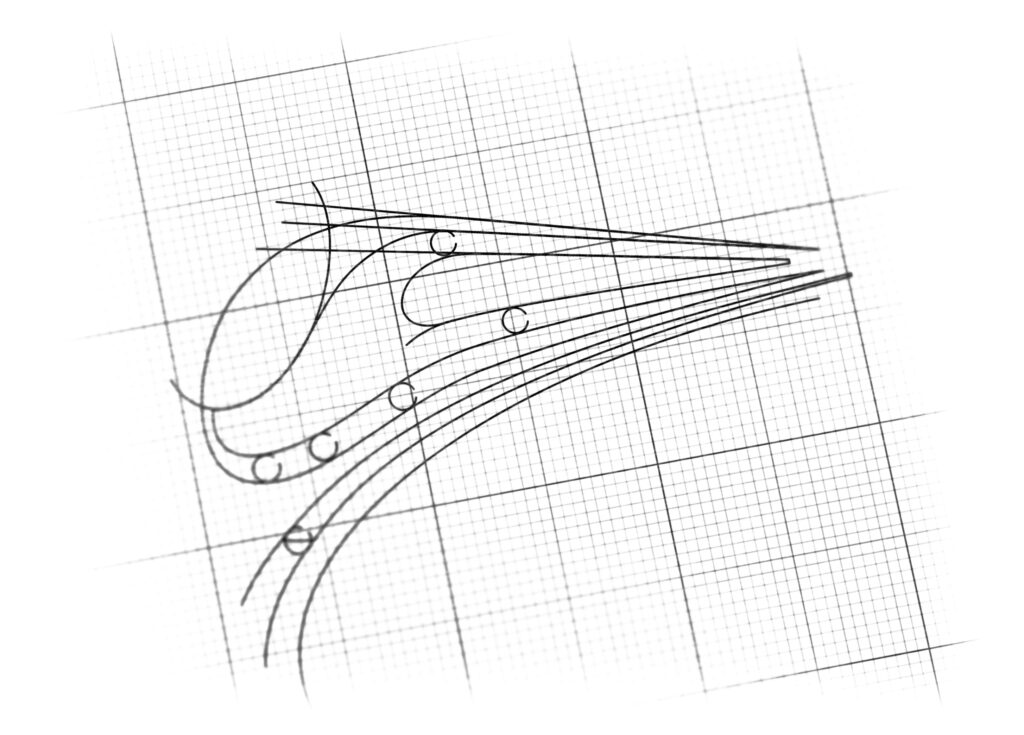
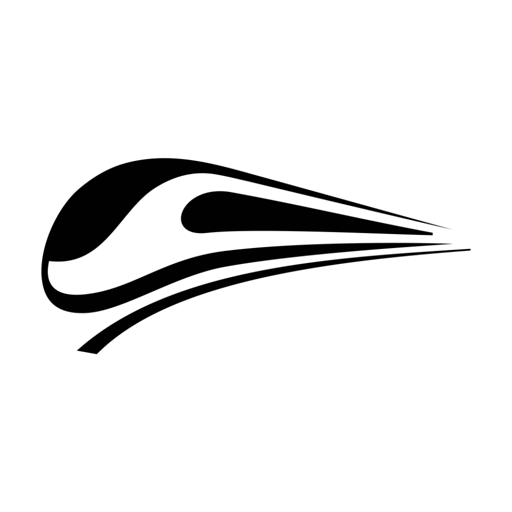
logo design for railway services
Brand Name
Atin Rail
Category
Railway Equipment
Year
2013
The Client
Atin Rail is a company specializing in Railway Services and Equipment (Train Equipment). The brand aims to be seen as a provider of modern, efficient, and high-speed solutions that ensure reliable transportation and maintenance. The logo needs to embody velocity, technology, and reliability.
The Challenge
The objective was to design a dynamic and streamlined mark that visually represents a “Modern Train in Motion” while conveying speed and technological sophistication. The challenge was to create an abstract, simplified form of a high-speed train that suggests rapid movement and efficiency, distinguishing Atin Rail from traditional, heavier industrial railway brands.


The Solution (Our Approach)
We designed a minimalist, horizontal emblem that uses clean lines and strategic color blocking to convey speed and modernity, based on three strategic concepts:
The Aerodynamic Silhouette (Modern Train): The primary gray form is a highly stylized, aerodynamic silhouette of a high-speed train (like a bullet train). The sleek, curved lines emphasize velocity, efficiency, and cutting-edge design, immediately placing Atin Rail in the modern era of rail technology.
The Blue Streak (Technology and Momentum): A prominent streak of light blue runs across the side of the train’s body. This element symbolizes advanced technology, electric power, and forward momentum. It draws the eye and enhances the perception of speed, suggesting that Atin Rail’s equipment and services are powered by innovation.
Horizontal Lines of Motion (Movement and Track): The train rests on subtle, curved horizontal lines that represent the rail tracks. These lines are exaggeratedly swept back, creating a strong visual sense of rapid motion and momentum, reinforcing the idea of reliable, fast service delivery.
The Outcome
The final design is a concise, powerful, and linear emblem that perfectly communicates the brand’s focus on speed, efficiency, and contemporary rail solutions.
The emblem strategically achieves the following:
Signals Modernity and Speed: The extreme aerodynamic shape, characteristic of modern high-speed rail, immediately communicates that Atin Rail deals in the latest, most efficient rail technologies and equipment. It promises rapid service delivery and state-of-the-art products.
Establishes Technological Focus: The contrasting Blue Streak adds a layer of visual interest and specifically links the brand to clean energy, high-tech systems, and innovation within the rail sector.
High Versatility and Legibility: The design is simple, linear, and highly scalable. Its strong horizontal orientation makes it ideal for use on signage, rolling stock, equipment, and digital banners, maintaining excellent readability even at high speeds or in small applications.
Aspirations of Reliability: While emphasizing speed, the solid gray body color anchors the design in engineering stability and reliability, ensuring that the client perceives the brand as both fast and trustworthy.
Overall, the Atin Rail logo transforms the complex idea of railway equipment into a simple, dynamic visual promise of Modern Velocity and Engineered Efficiency.

Color Palette Strategy
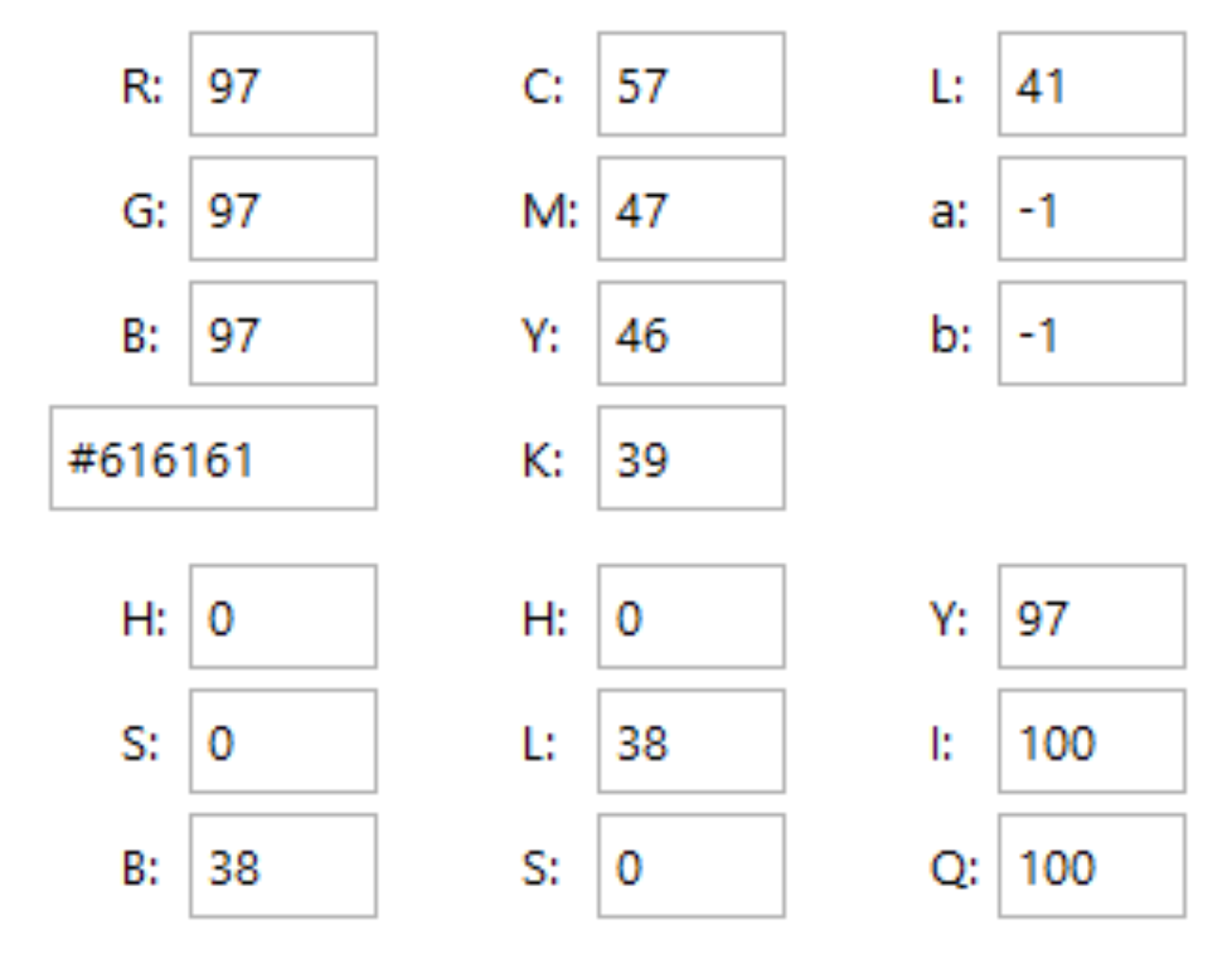
Industrial Gray/Gunmetal: The dominant color for the train body; symbolizes durability, industrial strength, precision engineering, and permanence.
Technological Blue: Used for the central streak; represents innovation, trust, speed, and advanced technology (often associated with electrical or digital systems).
White Space: Used to highlight the clean lines and emphasize the contrast, enhancing the perception of rapid movement.

Ready to discuss your visionary identity? Start your Strategic Logo Design Process with our experts today.
