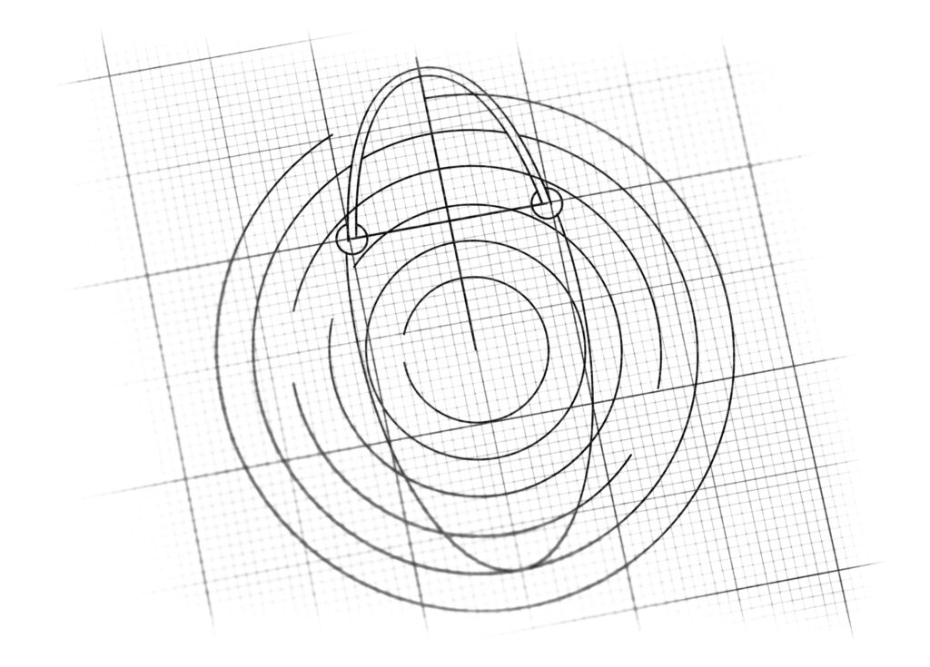
logo design for e-commerce retail brand
Brand Name
O Shop
Category
E-Commerce
Year
2011
The Client
Oshop is a retail or e-commerce brand that aims to create a memorable and simple identity. The core concept is to visually represent the initial letter ‘O’ of the brand name by using the universally recognized form of a Shopping Bag, signifying ease, convenience, and the complete retail experience.
The Challenge
The objective was to create an ultra-minimalist and scalable logo that seamlessly integrates the letter ‘O’ with the functional imagery of shopping. The challenge lay in conveying the action of commerce and retail through an extremely simple geometric shape while ensuring the design is instantly legible as both a letter and a relevant icon.


The Solution (Our Approach)
We designed a highly reductive, single-color emblem that leverages negative space and common retail imagery to achieve immediate recognition, based on three strategic concepts:
The Capital ‘O’ (Brand Identity): The foundation of the logo is a bold, thick circular ring, perfectly forming the initial letter ‘O’ of the brand name, Oshop. This provides excellent brand recognition and clarity.
The Shopping Bag Silhouette (Functionality): The circular ring is visually transformed into a Shopping Bag or a Price Tag by the addition of the small, curved handle at the top. This simple addition directly connects the abstract letter ‘O’ to the retail and commerce industry, fulfilling the client’s brief of the ‘O’ as a shopping bag.
Clean Minimalism and Focus: The design utilizes an exceptional degree of minimalism—just two shapes and two colors. This ensures the logo is highly versatile, instantly recognizable across small digital platforms (like app icons), and memorable, focusing all attention on the core concept.
The Outcome
The final design is a concise, highly scalable, and instantly understandable emblem that perfectly captures the brand’s function and identity.
The emblem strategically achieves the following:
Exceptional Versatility and Scalability: The geometric purity of the design ensures it maintains its integrity and legibility when scaled from a large banner to a small e-commerce favicon or app icon, a critical requirement for a modern retail brand.
Instant Brand Recognition: The clear dual interpretation—the letter ‘O’ and the Shopping Bag icon—creates an immediate and powerful mnemonic link between the brand name (Oshop) and its service (retail/commerce).
Communicates Ease and Completion: The circular shape universally represents completeness, safety, and a full loop, implying a complete and easy shopping experience from start to finish.
Stands Out through Simplicity: In a crowded digital marketplace, the bold, monochromatic design and clean execution ensure the logo is easily distinguishable and imparts a sense of confidence and directness.
Overall, the Oshop logo is a masterclass in minimalist design, using one simple form to convey Brand Identity (O) and Core Function (Shopping).

Color Palette Strategy
Bold Retail Red (Action and Attention): The primary color is a strong, vibrant red. Red is highly effective in retail marketing as it stimulates attention, urgency, and action (purchase).
Black/White Contrast (Clarity and Focus): Black is used for the thin handle to provide contrast and stability, while the use of negative space (white) in the center maintains clarity and focus, making the ‘O’ stand out distinctly.

Ready to discuss your visionary identity? Start your Strategic Logo Design Process with our experts today.
