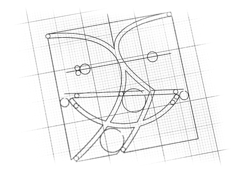
logo design for direct marketing agency
Brand Name
Dr. Sale
Category
Direct Marketing
Year
2016
The Client
Dr Sale is a specialized firm positioning itself as the “Doctor” or expert in Direct Marketing. The brand’s core promise is to deliver effective, data-driven, and highly beneficial marketing solutions, ensuring satisfied outcomes for both the client (the brand) and the end consumer.
The Challenge
The objective was to create a modern, friendly, and trustworthy mark that visually represents the concept of reciprocal satisfaction (a win-win outcome) that is central to successful direct marketing. The design needed to cleverly integrate the initials ‘D’ and ‘R’ (for Dr Sale) into a visual metaphor that conveyed partnership and positive results.


The Solution (Our Approach)
We designed a symmetric, two-part emblem that uses color and form to illustrate dynamic partnership and mutual benefit, based on three strategic concepts:
The Interacting Forms (D and R Monogram): The emblem consists of two distinct, mirrored forms—one blue and one orange—that come together at the center. The rounded, vertical shapes are designed to abstractly represent the letters ‘D’ (left form) and ‘R’ (right form), creating a strong, initial-based monogram for “Dr”. The closeness of the two forms symbolizes direct interaction and partnership.
The Shared Smile (Mutual Satisfaction): A single, continuous white smile stretches across the bottom of both forms. This “Shared Smile” is the most crucial element, symbolizing the mutually satisfying outcome of a successful direct marketing campaign—happiness for the client receiving sales (Orange) and happiness for the consumer making a rewarding purchase (Blue).
Color Contrast (The Two Sides of the Sale): The use of contrasting, vibrant colors (Blue and Orange) reinforces the two distinct entities involved in a transaction (seller and buyer, or client and Dr Sale). Blue often represents trust, logic, and professionalism, while Orange symbolizes energy, enthusiasm, and action (the ‘Sale’).
The Outcome
The final design is an immediate, impactful, and uniquely memorable emblem that perfectly communicates the brand’s expertise and positive philosophy.
The emblem strategically achieves the following:
Signals Expert Authority: The prefix ‘Dr’ is instantly established through the bold initial forms and the inherent professionalism conveyed by the blue color, positioning the firm as the trusted specialist in marketing optimization.
Communicates Reciprocal Success: The Shared Smile is an extremely effective visual shorthand for the brand’s core promise: “Satisfactory Two-Way Results.” It assures clients that Dr Sale’s strategies lead to profitable, ethical, and positive outcomes for everyone involved.
High Memorability and Simplicity: The logo’s simple, balanced, and contained square shape makes it highly versatile, legible at small sizes, and instantly recognizable. The clean, modern look is ideal for a consulting firm focused on data and efficiency.
Reinforces Direct Interaction: The forms of the ‘D’ and ‘R’ are designed to lean into each other, clearly symbolizing the “Direct” nature of the marketing service, emphasizing close interaction and targeted results.
Overall, the Dr Sale logo acts as a concise visual guarantee: Expert Strategy (DR) leads to Shared Success (Shared Smile).

Color Palette Strategy
Professional Blue: Represents trust, authority, and data-driven professionalism, often associated with the consulting side of the business (the ‘Doctor’).
Action Orange: Symbolizes energy, enthusiasm, and sales action, representing the marketing results and the direct interaction with the market (the ‘Sale’).
Clean White: Used for the Shared Smile, it provides high contrast and symbolizes clarity, simplicity, and the positive, mutual outcome.

Ready to discuss your visionary identity? Start your Professional Logo Design Process with our experts today.
