logo design for premium food brand
Brand Name
Shahchenar
Category
Food Branding
Year
2014
The Client
Shahchenar is an emerging food brand seeking to establish itself in the premium market. The brand’s core concept is to blend natural, high-quality ingredients (Chenar Leaf) with an image of supreme excellence, heritage, and trust (King/Crown). The name itself combines the Persian words for King (Shah) and Plane Tree (Chenar).
The Challenge
The primary challenge was to elegantly fuse two disparate concepts: the organic and natural origins of food (the leaf) with the regal authority and uncompromising quality (the crown). The design needed to be culturally resonant, immediately convey premium status, and feature a central focal point that symbolized exceptional value.


The Solution (Our Approach)
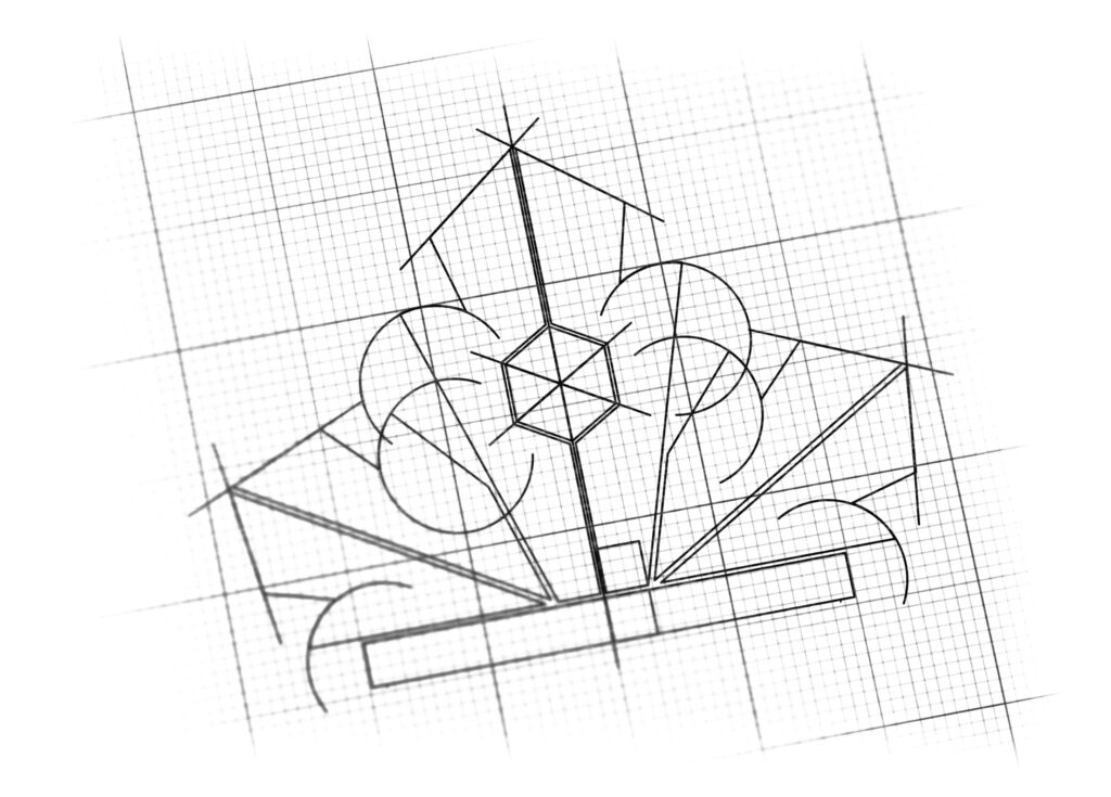
We designed a sophisticated, symmetrical emblem that transforms a familiar natural shape into a symbol of authority by combining three key elements:
The Crown/Maple Leaf Hybrid (Royal Standard): The primary shape is a stylized Chenar Leaf (or a similar maple/plane tree leaf) rendered as a King’s Crown. The five pointed lobes of the leaf are adapted into the traditional spikes of a diadem. This fusion instantly communicates the brand’s name, Shahchenar, and signifies that the product quality is “King-level” or the highest standard in its category.
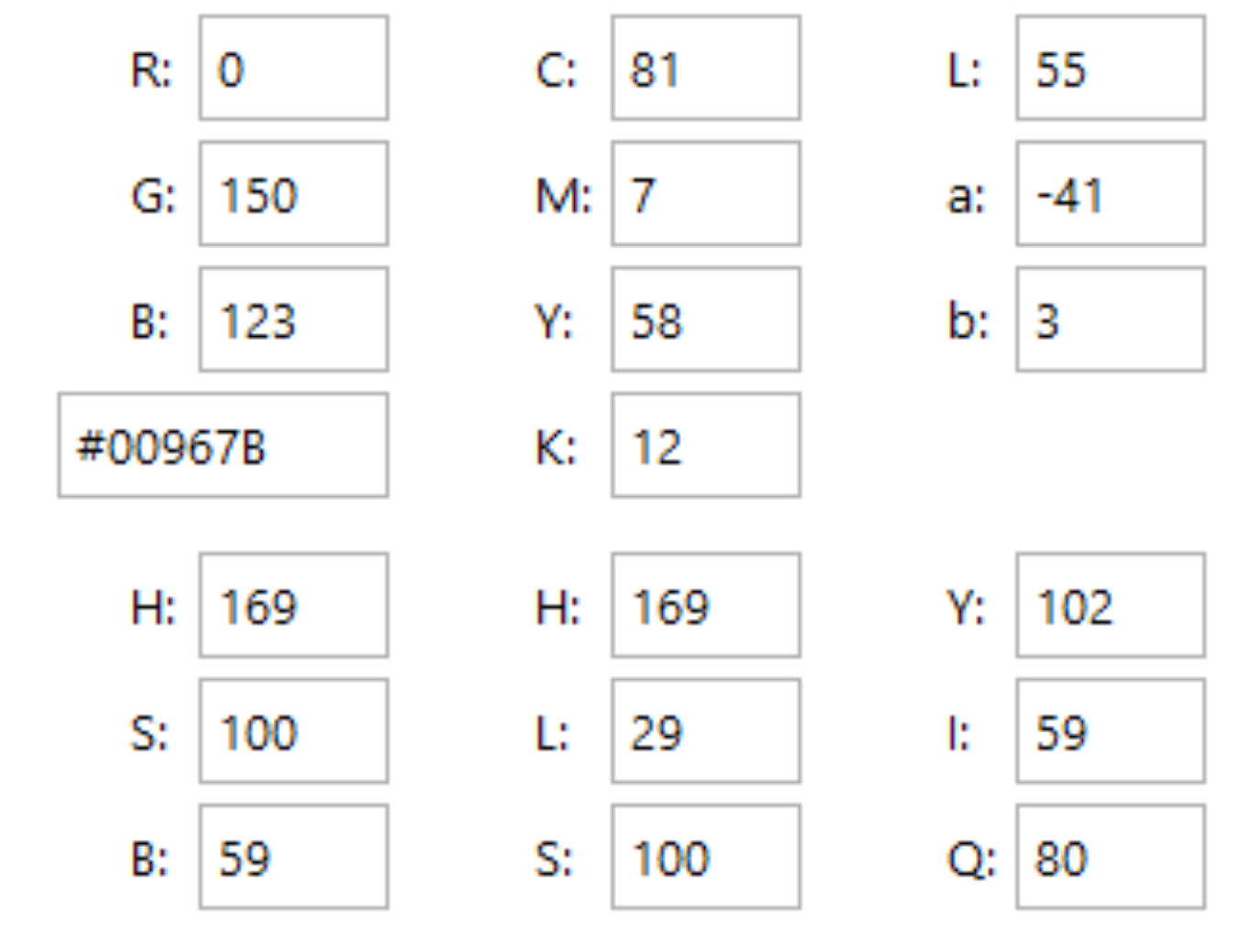
The Emerald Green Palette (Nature and Growth): The entire structure is executed in a deep, rich emerald green. This color strongly represents nature, growth, freshness, and organic quality (fitting for a food brand), while the depth of the hue provides a sense of luxury, wealth, and stability appropriate for a royal standard.
The Golden Jewel (Exceptional Value): At the central peak of the crown/leaf, a Golden Hexagonal Jewel (Gem) is placed. This is the “Priceless Jewel on the Crown”. It acts as a clear focal point, symbolizing the exceptional value, premium quality, and inherent worth of the Shahchenar products. Its multifaceted, geometric design adds a touch of modern precision to the ancient symbol of royalty.
The Outcome
The final design is an authoritative, clean, and highly memorable emblem that successfully navigates the balance between natural goodness and premium status.
The emblem strategically achieves the following:
Establishes Premium Positioning: By using the Crown motif and the deep Emerald Green, the logo immediately signals luxury and exclusivity, positioning Shahchenar above common, mass-market food brands.
Guarantees Quality and Heritage: The blend of the Chenar Leaf (symbolizing natural ingredients and heritage) with the Crown (symbolizing supremacy and long-lasting reign) assures customers of both the freshness of the ingredients and the uncompromising quality control of the final product.
Creates a Strong Visual Anchor: The prominent Golden Jewel focuses the viewer’s eye and serves as a visual promise of excellence and high worth, suggesting that the brand’s products are a valuable, precious part of the consumer’s diet.
High Adaptability: The symmetrical, clean lines of the design ensure that the logo maintains its impact and legibility across diverse applications, from high-end packaging and product labeling to digital media and corporate collateral.
Overall, the logo transforms the Shahchenar brand name into a powerful visual oath of Natural Excellence and Regal Quality.

Color Palette Strategy
Emerald Green (Nature, Luxury, Trust): The primary color, signifying natural freshness, growth, stability, and wealth. It anchors the brand in the food sector while elevating its luxurious appeal.
Golden Yellow/Bronze (Excellence, Value, Premium): Used exclusively for the central jewel, representing supreme quality, royalty, and the “most valuable” part of the offering.

Ready to discuss your visionary identity? Start your Strategic Logo Design Process with our experts today.
