
logo design for energy and fuel company
Brand Name
Hermes
Category
Energy
Year
2012
The Client
Hermes Energy is a company specialized in oil and energy products, especially high-performance fuels or technological lubricants. The main purpose of the brand is to emphasize the power, quality and innovation in the presentation of fuel or energy produced by applying advanced technologies (Digital/Pixelated).
The Challenge
In a large and traditional market (oil and gas) that usually deals with old symbols, Hermes Energy needed an identity that immediately conveys a sense of raw energy, technological precision and trust. The challenge was to combine the classic symbols of the industry (oil and flame) with a modern and advanced visual effect (pixel/halftone) to show the innovation of the brand.
The Solution (Our Approach)
We designed a visual emblem that dynamically and abstractly combines two vital symbols of the energy industry:
- Pixelated Flaming Flame (Technology and Power): The upper part of the logo is designed in the form of a blazing flame in a bright orange color. Instead of smooth borders, the flame is made up entirely of small dots or pixels (Halftone Pattern). This design not only symbolizes raw energy, but also clearly demonstrates the “digital technology and precision” that goes into the processing of Hermes Energy products.
- Silver Oil Drop (Product Essence and Purity): At the heart of the flame, a drop of oil or energy liquid (with a smooth, metallic appearance) is located. This drop symbolizes the brand’s “core oil and energy product”. Its metallic silver/gray color conveys a sense of high quality, purity and engineering precision.
- Synergy: The placement of the liquid drop (fuel) within the flame represents Transformation and the release of potential; that Hermes Energy products are the source of combustion power or energy.
The Outcome
The final design is a strong and modern visual identity that clearly conveys the brand’s promise: power and combustion (orange flame) combined with quality and technological precision (pixelation) and product purity (silver drop). This logo represents Hermes Energy as an innovative leader in the oil and energy industry.
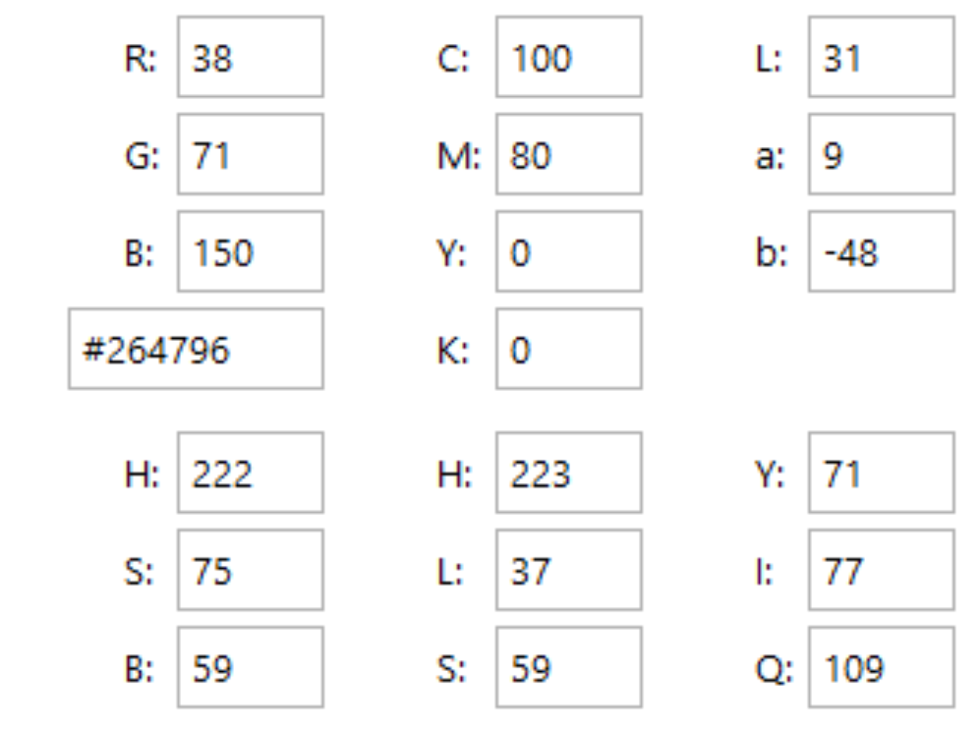
Color Palette Strategy
- Ignition Orange: The dominant color for the flame; symbolizes energy, combustion, power and movement. This color immediately attracts attention and conveys a sense of potential power.
- Engineered Silver: The color of the central drop; symbolizes refinement, purity, durability and engineered precision. This color gives the logo weight and a sense of industrial quality.
Ready to discuss your visionary identity? Start your Strategic Logo Design Process with our experts today.