
logo design for food additive brand
Brand Name
Clara Castle
Category
Flavor Variety
Year
2010
The Client
Clara Castle is an emerging brand in the food and beverage market, specializing in Authorized Food Additives, Natural Flavorings, or Health-Based Food Products. The brand emphasizes the use of natural ingredients, guaranteed quality, and the provision of a wide range of diverse flavors.
The Challenge
In a saturated market filled with “natural” and “healthy” labels, Clara Castle required an identity that immediately communicated three key messages: Health (Nature), Quality/Trust (Branding), and Variety (Flavors). The main challenge was to integrate the symbol of strength and authenticity (the Castle) with the finesse and dynamism of nature (the leaves and colors).
The Solution (Our Approach)
We designed a dynamic, circular emblem that skillfully merges three contrasting yet complementary elements:
The Blue Castle Tower (Authenticity & Security): Inspired by the name “Clara Castle,” the castle symbol was chosen as the central pillar of the brand. The bright blue color not only conveys freshness but symbolizes safety, trust, and engineered quality in the context of authorized food additives.
The Ring of Colorful Leaves (Health & Variety): The castle is surrounded by a vibrant circular arrangement of leaves and natural symbols.
Diverse Leaves: These directly symbolize “Health-Based Products” and organic, natural ingredients.
Vibrant Colors (Red, Yellow, Green, Pink): This cheerful palette represents the “Diverse Flavors” (Multi-Flavour) and the wide variety within the product line.
Fork-like Interpretation (Functional Connection): The stylized shape of the castle tower subtly evokes a sturdy and safe eating utensil (fork), reinforcing the product’s connection to consumption and dining.
The Outcome
The final design is a circular, memorable, and dynamic logo that visually segregates the brand’s promises: Variety and Nature (leaves and colors) revolving around a central core of Quality and Trust (the castle). This emblem positions Clara Castle as a credible and vibrant leader in the health-focused product sector.
Color Palette Strategy
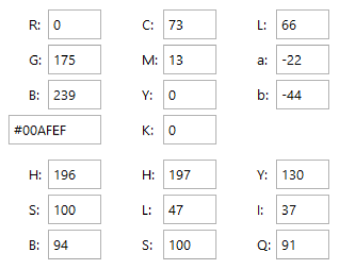
Fresh Castle Blue: The primary color for the castle; symbolizes trust, cleanliness, and freshness.
Green & Yellow (Natural Vitality): The dominant colors for the leaves; represent life, growth, and organic sourcing.
Red & Dark Pink (Flavour Burst): Secondary colors used to draw attention and emphasize energy, excitement, and the variety of flavors (such as berries and seasonal fruits).
Ready to discuss your visionary identity? Start your Custom Logo Design Process with our experts today.