
logo design for luxury water features
Brand Name
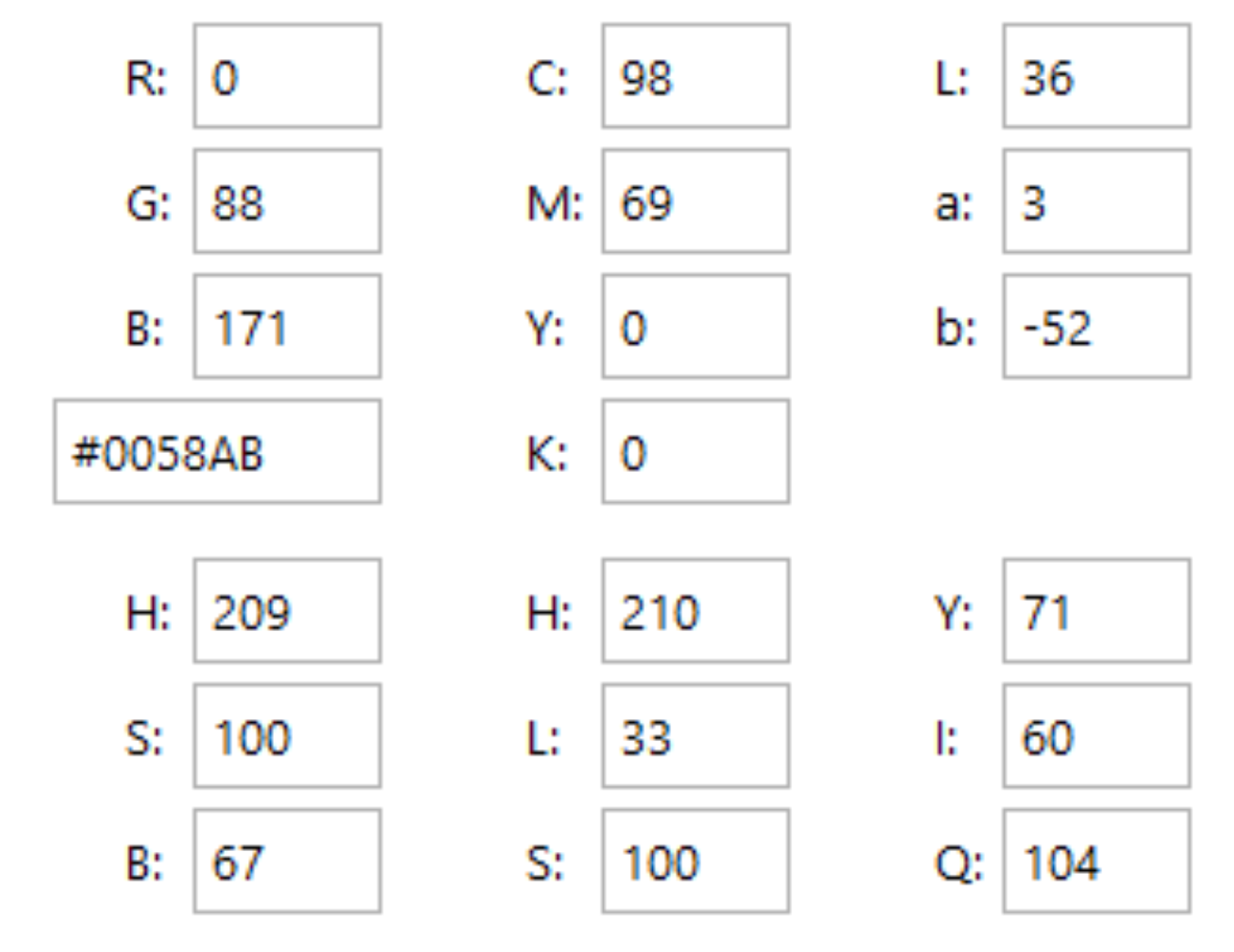
AG
Category
Water Features
Year
2014
The Client
AG is a bespoke design and manufacturing company specializing in high-end Musical Fountains and Water Features. Their products are installed in luxury residential, commercial, and public spaces, blending hydrodynamics with synchronized audio and lighting technology.
The Challenge
AG needed a sophisticated and timeless logo that could convey the delicate yet powerful synchronization of water (the fountain) and sound (the music). Their previous identity was overly literal and failed to communicate the artistry and premium quality of their specialized installations. The core challenge was to design a monogram that subtly references both the technology of sound synchronization and the graceful movement of water, while maintaining an elegant, high-end feel.
The Solution (Our Approach)
We crafted a fluid and highly conceptual monogram that artfully intertwines the initials ‘A’ and ‘G’ to form a unified, symbolic shape. The design strategy focused on three specific visual metaphors:
- Water Dynamics (The Letter ‘A’): The initial ‘A’ is represented by a smooth, ascending arc that mimics the shape of a jet of water or a fountain spray at its apex. This conveys the primary product line and the element of graceful motion.
- The Basin (The Letter ‘G’): The initial ‘G’ forms the lower, grounding element—a wide, flowing curve that simultaneously suggests a fountain basin (Houdh) where the water collects and circulates.
- The Gramophone Concept (Sound & Nostalgia): The overall silhouette of the intertwined ‘A’ and ‘G’ is intentionally reminiscent of the iconic shape of a vintage gramophone speaker. This sophisticated reference instantly connects the visual to the “Musical” aspect of the brand, suggesting classic quality, rich sound, and timeless elegance.
The design utilizes clean, flowing curves (flat design) but employs subtle variations in line weight and an implied overlap, effectively suggesting 3D volume and depth without relying on gradients or shadows. This provides a sense of premium solidity and dynamic motion.
The Outcome
The AG monogram is a masterpiece of conceptual integration, providing the client with a brand mark that is both abstract and meaningful:
- Elegance and Sophistication: The smooth, calligraphic quality positions AG firmly in the luxury design market.
- Dual Meaning: It effectively communicates both the “A” and “G” initials and the core services (water and music) in a single, flowing mark.
- Premium Feel: The implied depth and classic shape give the brand identity a durable, high-quality feel suitable for large-scale architectural projects.
Services Provided
- Custom Monogram Logo Design (A+G)
- Conceptual Design Strategy (Gramophone & Hydrodynamics)
- Flat Design with Implied 3D Volume
- Brand Mark Development
- Vectorization for Signage and Print Materials
Ready to discuss your visionary identity? Start your Strategic Logo Design Process with our experts today.