logo design for automotive performance
Brand Name
HPERIN
Category
Electrifying Automotive
Year
2014
The Client
HPERIN is a specialized manufacturer and distributor of high-performance automotive electrical products. Their focus is on components that enhance vehicle speed, efficiency, and reliability, appealing to auto enthusiasts and performance modification professionals.
The Challenge
HPERIN’s market is highly competitive, dominated by traditional, often generic-looking parts manufacturers. They required a brand identity that immediately communicated speed, power, and cutting-edge electrical technology. The challenge was to create a symbol that stood out on packaging and digital channels, merging the concept of rapid motion with the raw power of electricity, all while conveying a feeling of absolute safety and trust despite the high-voltage nature of their products.


The Solution (Our Approach)
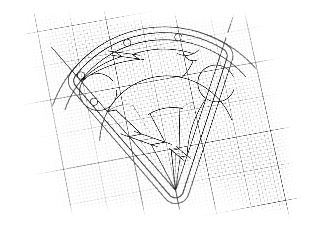
We designed a powerful and dynamic emblem that serves as a modern mascot and seal of quality for HPERIN. The solution is built around a careful synthesis of three key visual elements:
- The Gazelle (Ghazal): This animal was chosen as the central figure because it is a universal symbol of speed, agility, and grace. The Gazelle is depicted mid-leap, emphasizing a sense of unstoppable forward movement and high-performance capability.
- Repetitive Electric Motif: To ensure the logo is intrinsically linked to the electrical industry, the entire form of the Gazelle is composed of stylized lightning bolt shapes. The legs, tail, and the charging shape above its head are all angular representations of electricity symbols. This design choice visually confirms that the speed and agility of the brand are powered by raw electrical energy.
- The Inverted Shield (Safety Paradox): The entire dynamic image is enclosed within a distinctive inverted triangle/shield boundary. Traditionally, this downward-pointing triangle might suggest caution. However, in this context, it is strategically used to counter the inherent risks of high-voltage components. This shape acts as a bold, assertive badge, signifying that HPERIN’s products are not only powerful but are thoroughly tested, contained, and absolutely safe (secure), providing a sense of unwavering reliability to the consumer.
The Outcome
The final design is an aggressive yet sophisticated emblem that achieves the client’s goal of standing out in a crowded market.
- Impactful Recognition: The unique shield shape and dynamic animal mark create a memorable and premium visual asset perfect for product serialization and branding.
- Clear Value Proposition: The logo clearly communicates the brand promises: Performance (Gazelle) and Reliability/Safety (Inverted Shield).
- A Unified Story: The seamless integration of the lightning bolts into the animal form tells the story of Electrified Speed, positioning HPERIN as a leader in automotive electrical enhancement.

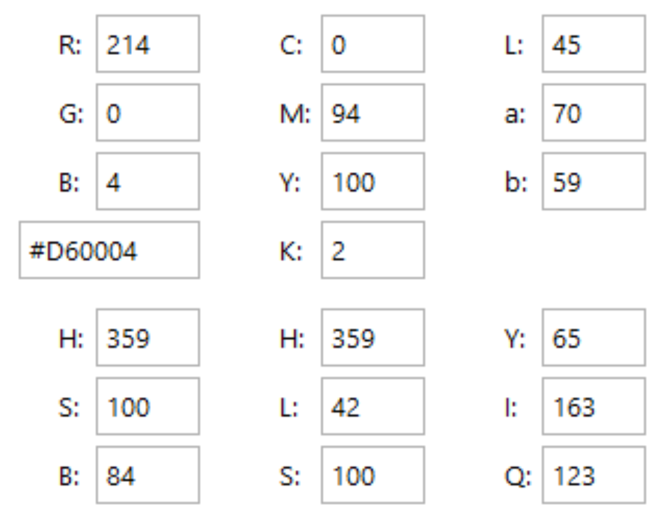
Color Palette Strategy
- Mascot & Emblem Logo Design
- Geometric Visualization of Motion & Power
- Brand Shield Conceptualization
- Monochromatic Design System
- Vectorization for Manufacturing and Digital Use

Ready to discuss your visionary identity? Start your Professional Logo Design Process with our experts today.
